AI-powered Sentiment Analysis
Overview
Google, a leader in artificial intelligence, needed a compelling demo for an exclusive conference attended by C-suite executives from top global companies. The goal was to showcase Google’s AI model - Gemini's powerful ability to understand and analyze product sentiment from diverse data sources.
In an extremely tight two-week timeline, I led the end-to-end UX/UI design and front-end development (using a low-code tool) for this high-visibility demo. The final product, "Project Sentio," was a resounding success, capturing the audience's attention and generating significant post-conference interest.
My Role: Lead UX/UI Designer, Prototyper (Figma & FlutterFlow), Front-End Developer
Team: 1 UX Designer (myself), 4 Engineers, Management from Cognizant and Google
Timeline: 2 Weeks (Sprint)
Tools: Figma, Google Slides, FlutterFlow
The Challenge
How can we effectively demonstrate the power and versatility of a complex AI model to a non-technical, executive audience in a short, live presentation?
The engineering team had a powerful AI model but needed a user-centric application to bring its capabilities to life. The demo had to be:
Clear & Compelling: Immediately communicate the value proposition of analyzing product sentiment.
Impressive: Showcase the AI's ability to process varied data types (internal data, YouTube, web content).
Action-Oriented: Conclude with a "wow" moment, like generating marketing assets based on the AI's insights.
Feasible: Be designed, built, and polished in an intense two-week sprint for the CEO's office.
The Process: From Brief to Functional Demo in 10 Days
Given the extreme time constraint, we adopted a highly agile and collaborative process. My role was to translate the technical brief into an intuitive user experience, while constantly aligning with engineering and management stakeholders.
Visualization Idea: A simple timeline graphic for the 2-week sprint.
Week 1:
Day 1: Kickoff & Brief
Day 2-3: Lo-fi Wireframing (Figma & Google Slides) & Stakeholder Alignment
Day 4-5: Mi-fi Mockups & Core Flow Finalization
Week 2:
Day 6-7: High-Fidelity UI Design
Day 8-9: Front-End Build in FlutterFlow & API Integration
Day 10: Final Polish, Backup Figma Proto, & Demo Scripting
Key Design Decision #1: Clarifying the Narrative
Problem: The AI's key strength was understanding multiple data sources. My initial design showed all search results (Internal, YouTube, Web) on a single, consolidated page. While efficient, it failed to tell a clear story.
Insight: During a review, the team pointed out that for a live demo, a presenter needs a structured narrative. Separating the sources would more explicitly highlight the model's versatility and make the presentation easier to follow.
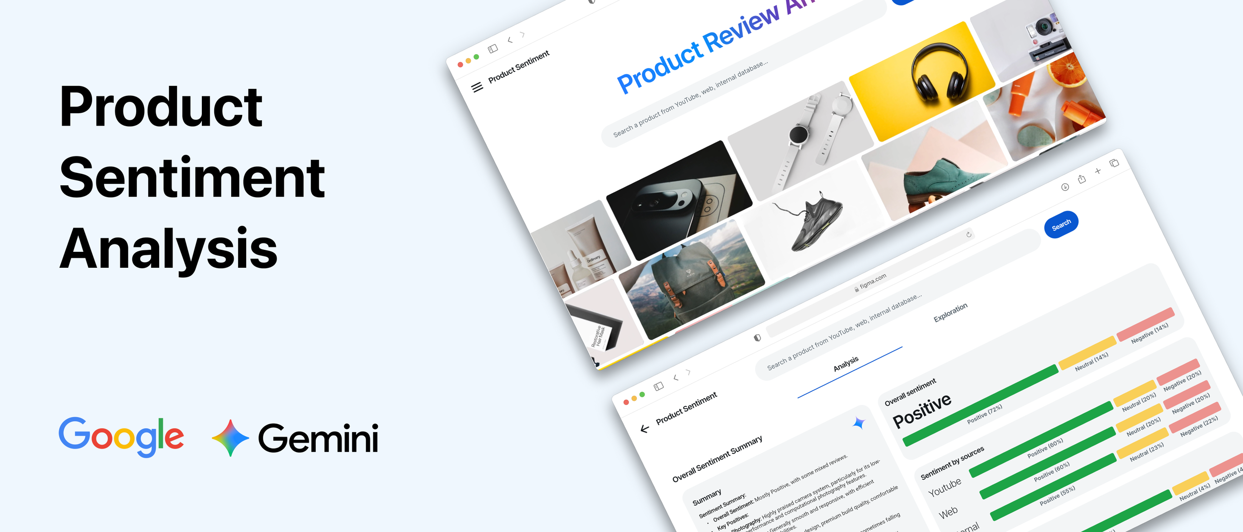
Solution: I redesigned the results screen to use a tabbed or multi-step approach. The presenter could now deliberately walk the audience through each data source, first showing internal database results, then moving to unstructured YouTube data, and finally to web articles.
Impact: This simple change transformed the user flow into a compelling story, making the demo more powerful and easier for the presenter to narrate.
Visualization Idea: A "Before & After" comparison of wireframes.
Before: A single screen with a long, scrolling list of mixed-source results. Annotation: "Initial design combined all sources, diluting the key message."
After: A screen with clear tabs at the top: "Internal Data," "YouTube," "Web Search." Annotation: "Iterated design separates sources to create a clear narrative path for the demo."
Key Design Decision #2: Designing for Reality
Challenge: My initial high-fidelity designs for the sentiment analysis dashboard featured intricate and beautiful data visualizations. However, I had designed them without a full understanding of the data engineering team could realistically provide in two weeks.
Constraint: The engineering team informed me that the model's output for this demo would be focused on a few key metrics: an overall sentiment score, a list of top positive features, and a list of top negative features.
Solution: I had to pivot from "fancy" to "functional and impactful." The challenge was to design a compelling visualization with limited data points without it looking bland. I focused on:
Clarity & Hierarchy: Using a large, prominent score for the overall sentiment.
Clear Categorization: Two distinct columns for "Top Positive Features" and "Top Negative Features."
Simple Visual Cues: Using "pills" or tags with clear icons (e.g., thumbs up/down) and color-coding (green for positive, red for negative) to make the features instantly scannable.
Impact: This redesign resulted in a dashboard that was not only feasible to build but was also more direct and easier for the audience to understand at a glance. It prevented us from over-promising with visuals that the backend couldn't support.
Visualization Idea: A comparison of the two data visualization designs.
Concept A (Ideal): A complex radar chart or multi-layered donut chart. Annotation: "Initial concept was visually ambitious but technically unfeasible on the timeline."
Concept B (Final): The final, clean design. A big score, two columns with colored tags. Annotation: "Final design focuses on clarity and impact, using the available data effectively."
The Solution: A Seamless Flow from Search to Creation
The final demo provided a "golden path" for the presenter, leading the audience through a simple yet powerful journey.
1. The Search: The user, a Product Manager, starts with a simple search for a product.
2. Source Selection: They are presented with categorized results and select the specific sources they want to analyze.
3. The Analysis: The AI-powered dashboard reveals the overall sentiment, key positive and negative product features.
4. The Creation: In the final "wow" moment, the user clicks "Generate Campaign Images," and the demo uses the top positive features (e.g., "long battery life") to instantly create marketing images.
Visualization Idea: A user flow diagram showing the four final screens in sequence with arrows connecting them.
[Screen 1: Search Bar] -> [Screen 2: Tabbed Source Selection] -> [Screen 3: Sentiment Dashboard] -> [Screen 4: Generated Campaign Images]
Bridging Design and Development with Low-Code
A unique aspect of my contribution was building the front-end UI myself using FlutterFlow. This allowed for an incredibly tight feedback loop. I would design a screen in Figma, build it in FlutterFlow, and our engineers could immediately start binding the UI to the live APIs. This parallel workflow was instrumental in meeting our deadline.
We also created a complete, clickable Figma prototype as a rock-solid backup in case of any network issues during the live conference.
The Impact: A "Lean-In" Moment
The demo was a standout success at the conference.
High Audience Engagement: During the presentation, we observed a palpable shift in the room. Many executives in the audience physically leaned in to get a closer look at the screen, a clear indicator of high interest.
Generated Business Leads: Several executives approached the Google team after the presentation to learn more about the AI model and its applications for their own companies.
Internal Acclaim: The demo was highly praised by the CEO's office and management for its clarity, polish, and effective storytelling.
Learnings & Reflections
This project was a masterclass in execution under pressure. My biggest takeaways were:
Product Management is a Core Design Skill: In a fast-paced project, my role extended beyond pixels. I proactively sent meeting summaries with clear decisions and next steps, managed stakeholder feedback, and made pragmatic design compromises. This ensured everyone was aligned and moving forward.
Embrace Constraints to Foster Creativity: The limitation on data for the visualization forced me to prioritize clarity over complexity, which ultimately resulted in a more effective and understandable design for the target audience.
The Power of Adaptable Tooling: Being flexible enough to switch from Figma to Google Slides for stakeholder reviews, and then using FlutterFlow for development, was key to our speed. The right tool depends on the audience and the task at hand.
If I had more time, I would have:
Conducted User Research: Even quick interviews with 1-2 product managers could have added another layer of validation to the demo's use case and flow.
Further Polished the Visual Design: While clean and functional, another week would have allowed for more subtle animations, micro-interactions, and visual refinements to further elevate the premium feel of the Google brand.