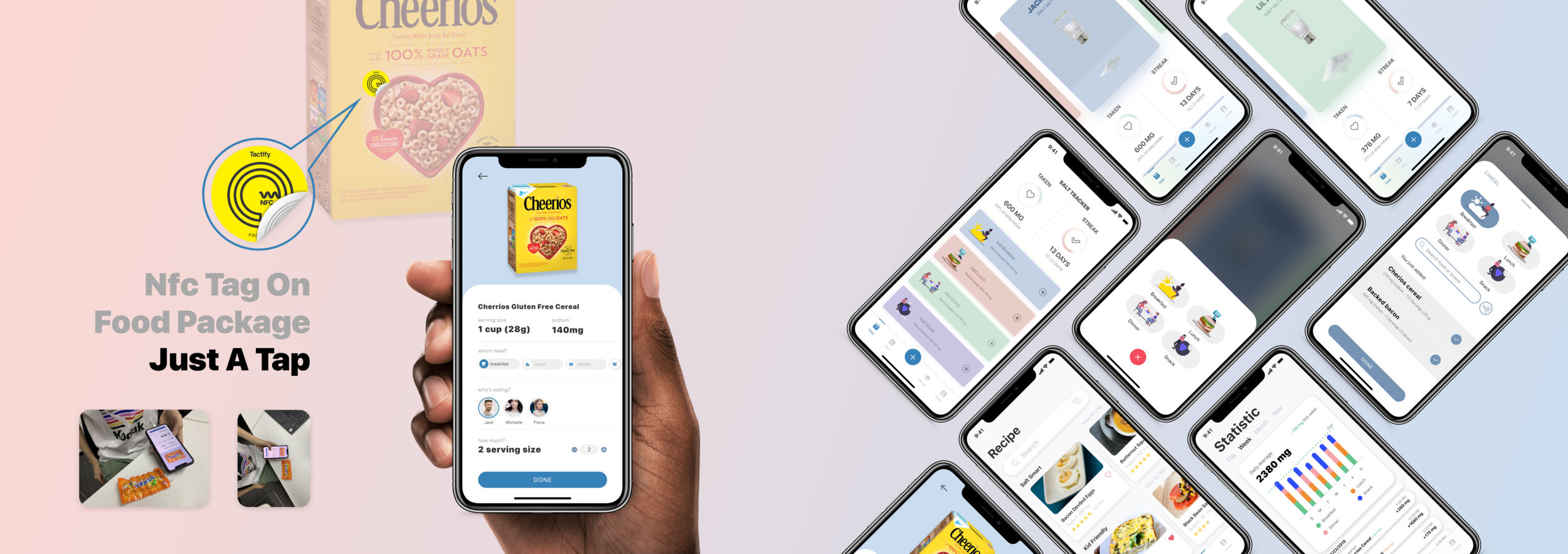
A habit-forming mobile app that helps users track and reduce sodium intake — from daily logging to the grocery aisle.
Excess sodium is one of the most preventable causes of cardiovascular disease — yet most people have no accurate sense of how much they consume. The problem isn't awareness; people know salt is bad for you. The problem is that sodium hides in processed food, accumulates invisibly across meals, and no existing tool makes it easy to see the full picture.
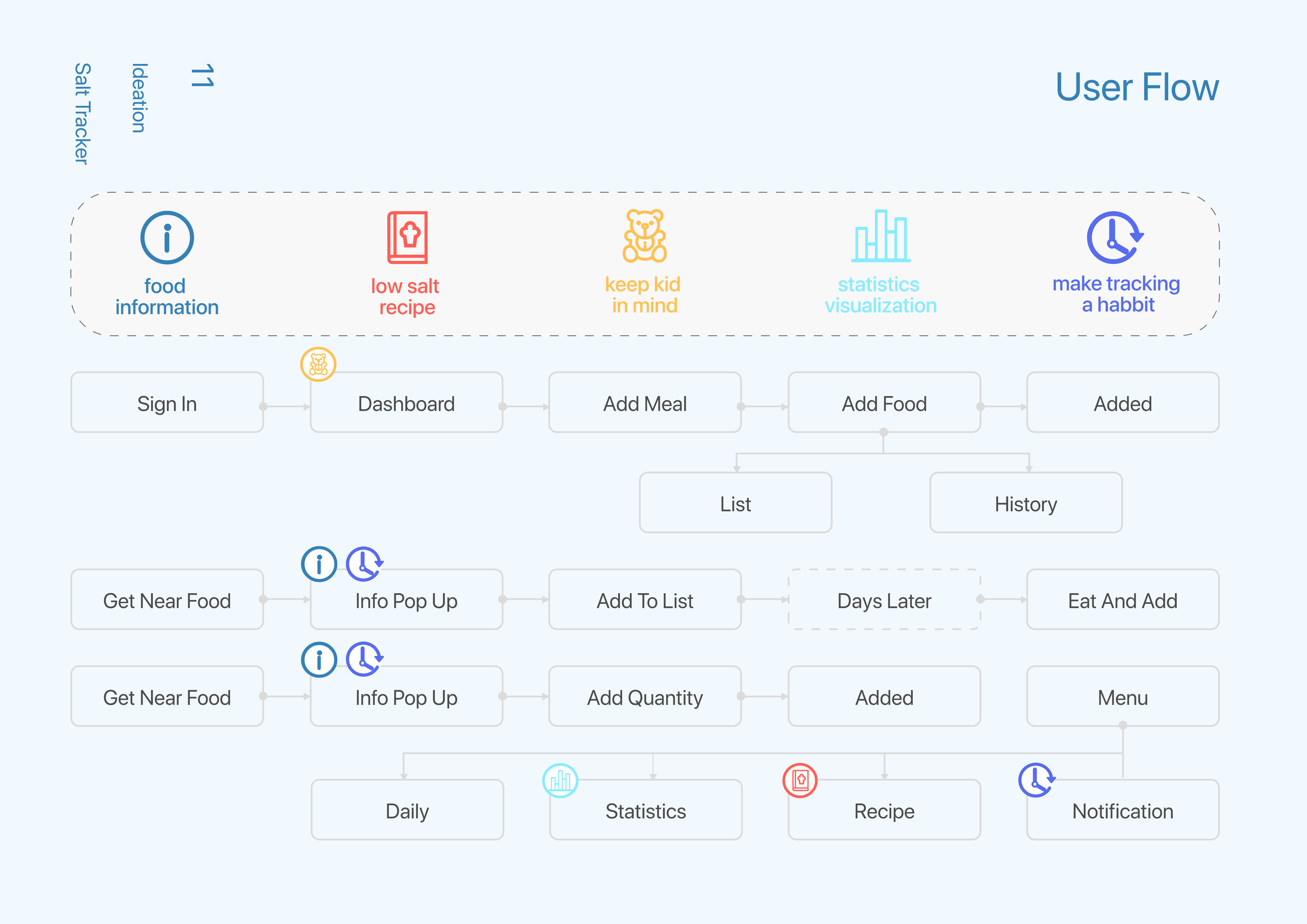
This project explores how to close that gap: a four-tab iOS app built around effortless logging, legible patterns, and a service design extension that intervenes at the grocery store — where most sodium decisions are actually made.
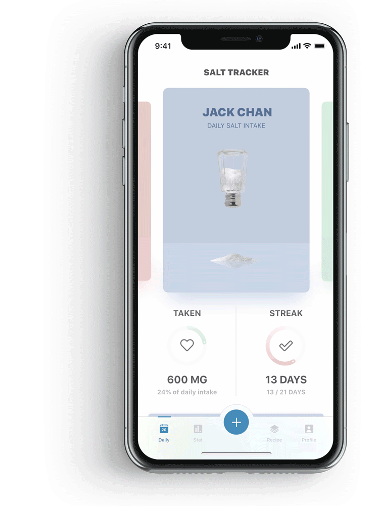
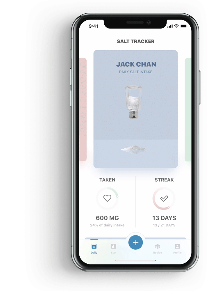
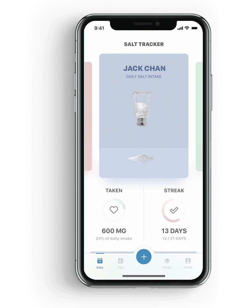
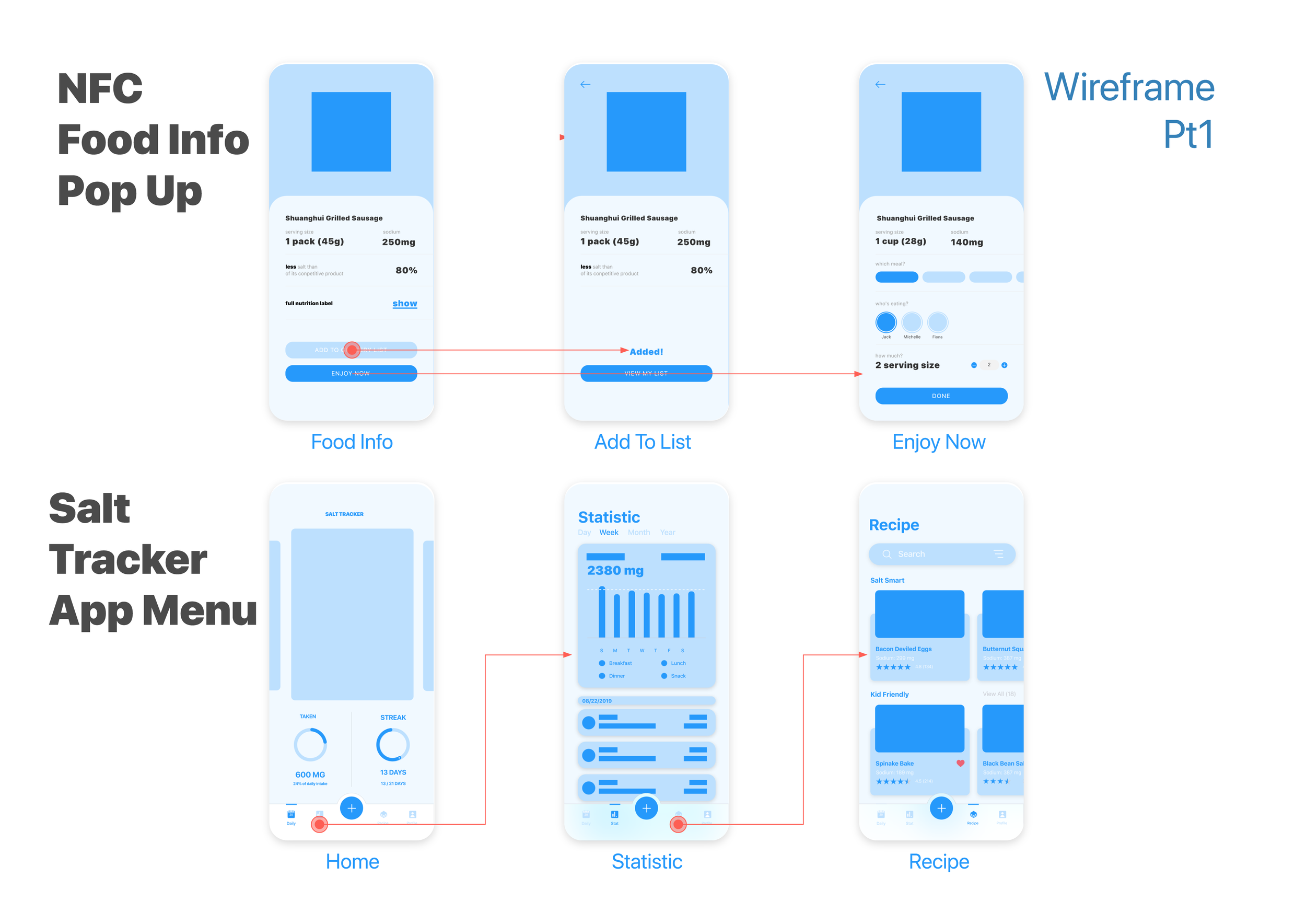
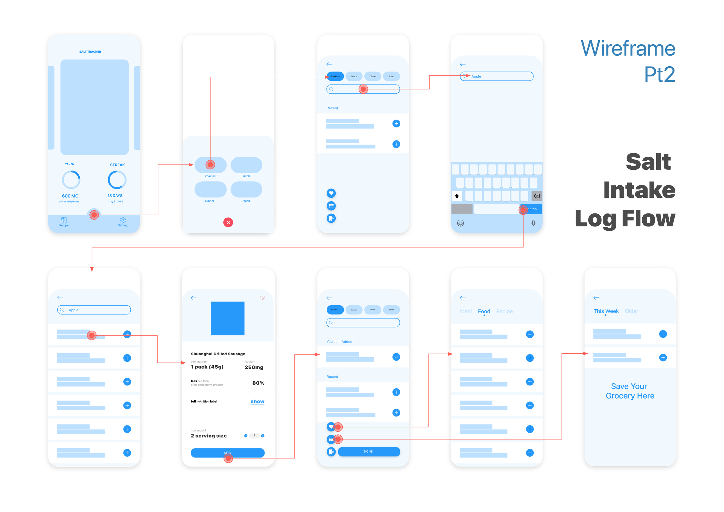
The daily view shows your remaining sodium budget as a salt shaker that fills as you eat. Tapping the floating button opens a step-by-step logger — category, food item, confirm — with no free-text entry required. A salt-drop animation on completion closes the action with a small moment of delight.
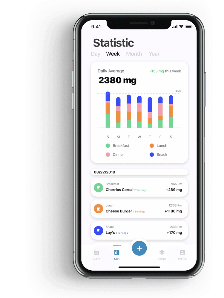
Bar charts break down sodium by meal type — breakfast, lunch, dinner, and snacks in four distinct colors. Individual triangle bars represent each logged entry, making it possible to pinpoint specific meals driving excess. Weekly and monthly views surface patterns that single-day awareness alone misses.
Swipeable recipe cards are filtered by meal type and cuisine. Each card shows the sodium count before you commit — so reducing intake doesn't require research, just slightly better defaults when you're deciding what to cook.
Logged entries are editable and timestamped. A slide-down gesture opens edit or remove options inline — no separate screen, no navigation cost. Keeping corrections effortless encourages accurate logging rather than leaving wrong entries uncorrected.
Research showed that salt taste receptors adapt after roughly three months of reduced intake — food that once tasted bland starts to taste normal. The app surfaces this fact as a milestone card at the 3-month mark, giving users a science-backed reason to keep going rather than relying on willpower alone.
Research showed that 77% of daily sodium comes from processed food — meaning most sodium decisions are made in the grocery store, not the kitchen. The app extends into physical retail through an NFC tag integration: users tap any packaged product to instantly see its sodium content and how it fits their remaining daily allowance, without manually reading and calculating nutrition labels.
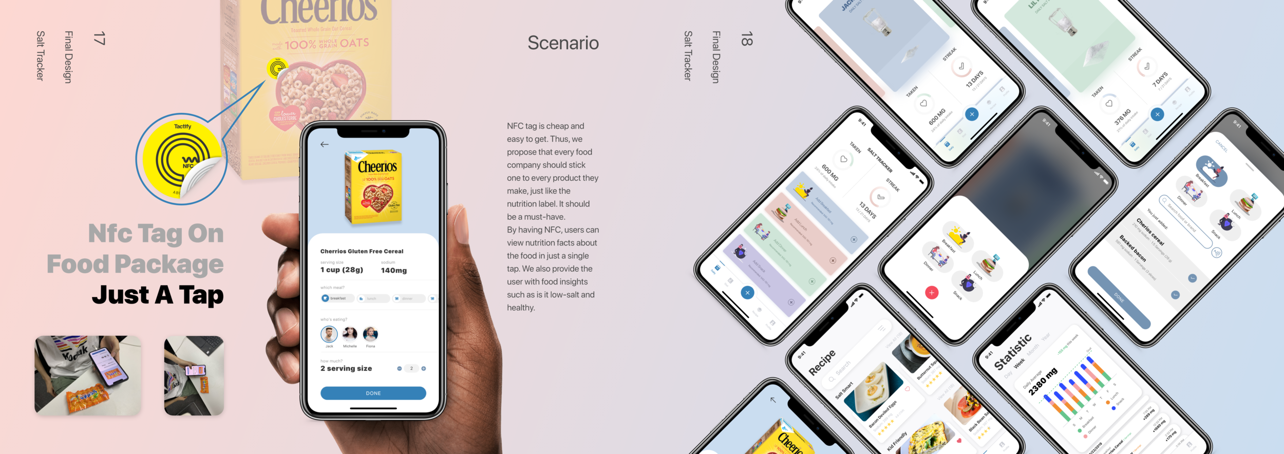
A single tap pulls the product's sodium data and generates a personalized health rating calibrated to the user's current daily intake and goal — before the item goes in the cart.
.png)
Comparing two pasta sauces in a supermarket aisle: one tap replaces the effort of reading two nutrition panels and doing sodium math on the spot.
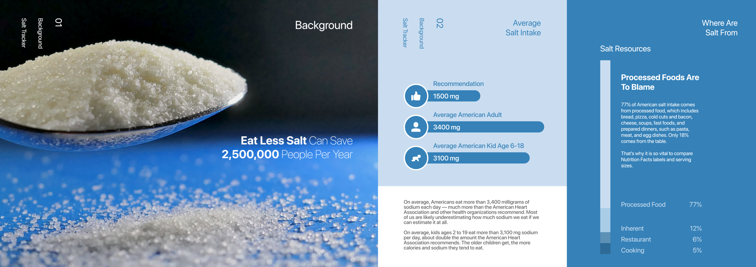
The World Health Organization estimates that 2.5 million deaths could be prevented annually if global salt consumption met recommended levels. In the US, the average person consumes more than double the advised amount — not because they're adding salt at the table, but because sodium is already built into the processed food they eat every day.

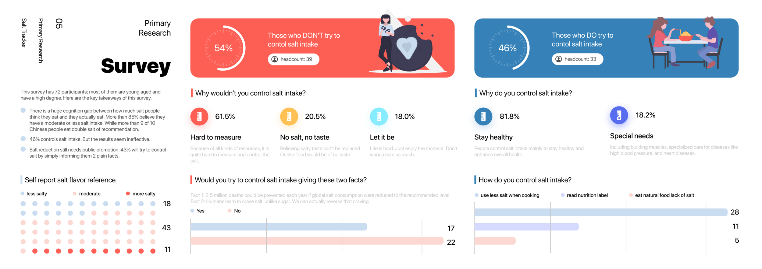
I interviewed participants across three groups to understand how sodium habits form, how different life contexts shape tracking motivation, and where existing tools fall short.
.png)
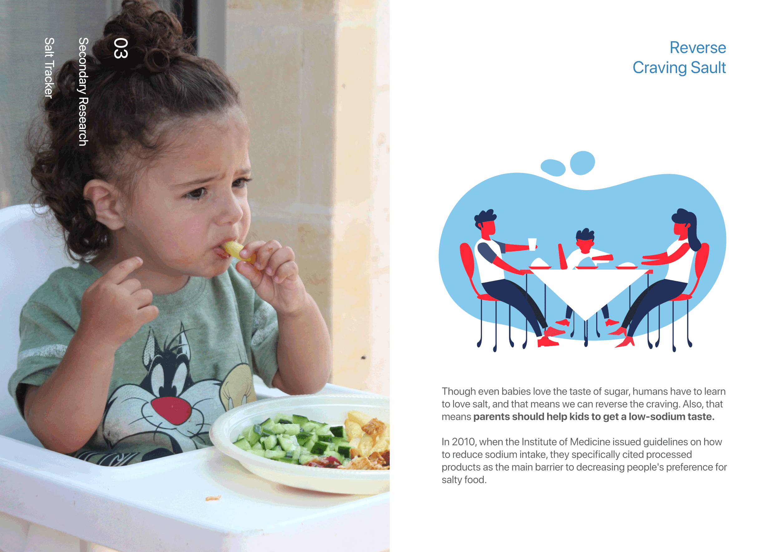
Parents cooking for families showed the strongest engagement with nutritional information but also the deepest resistance to change — decades of cooking habits shaped by their own upbringings made salt-reduction feel like a loss, not a gain.
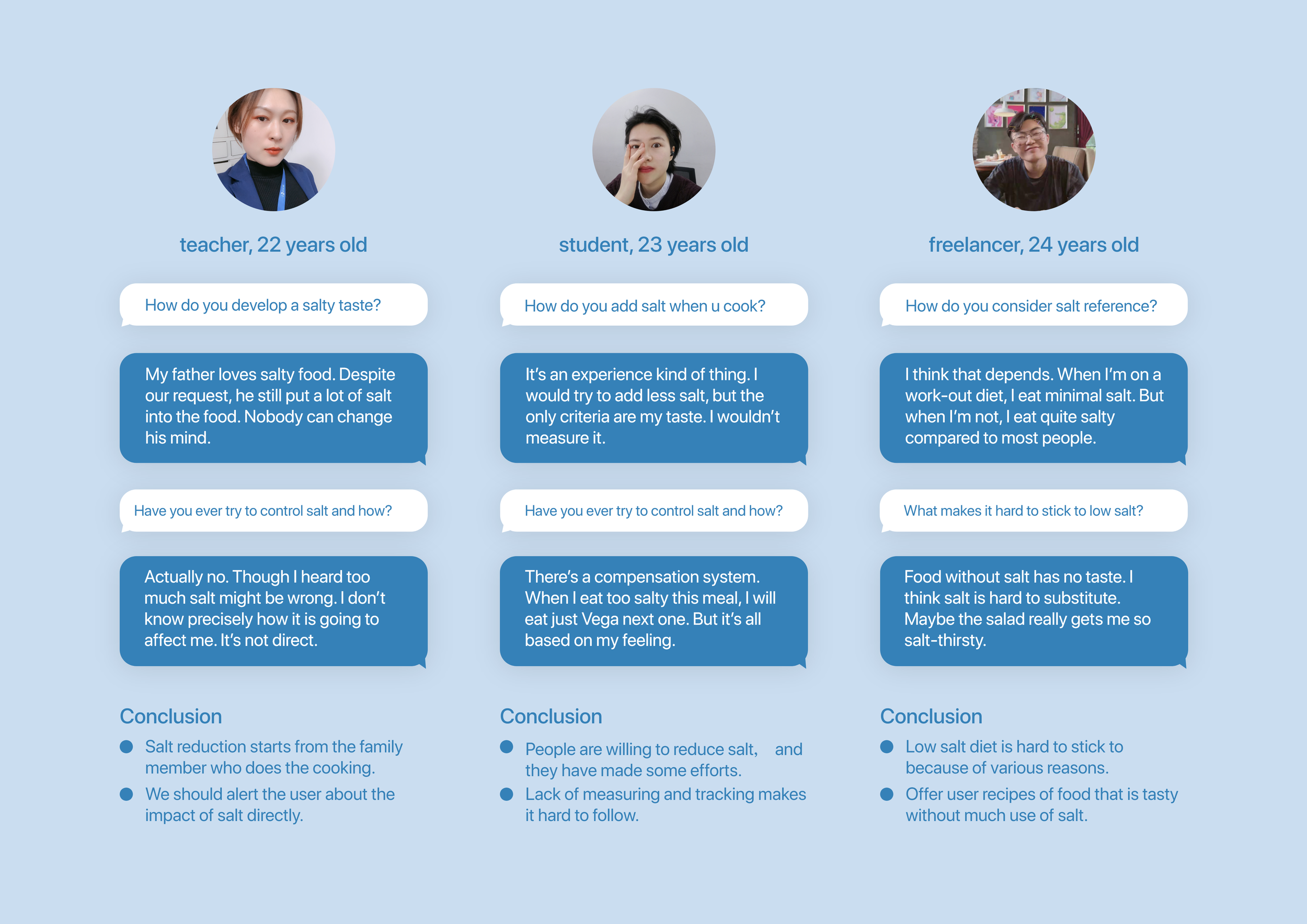
Young singles eat out frequently and rely on packaged ingredients at home. They're aware salt is a health concern, but tracking feels like effort they haven't committed to yet — more of an "I'll do that someday" behavior.
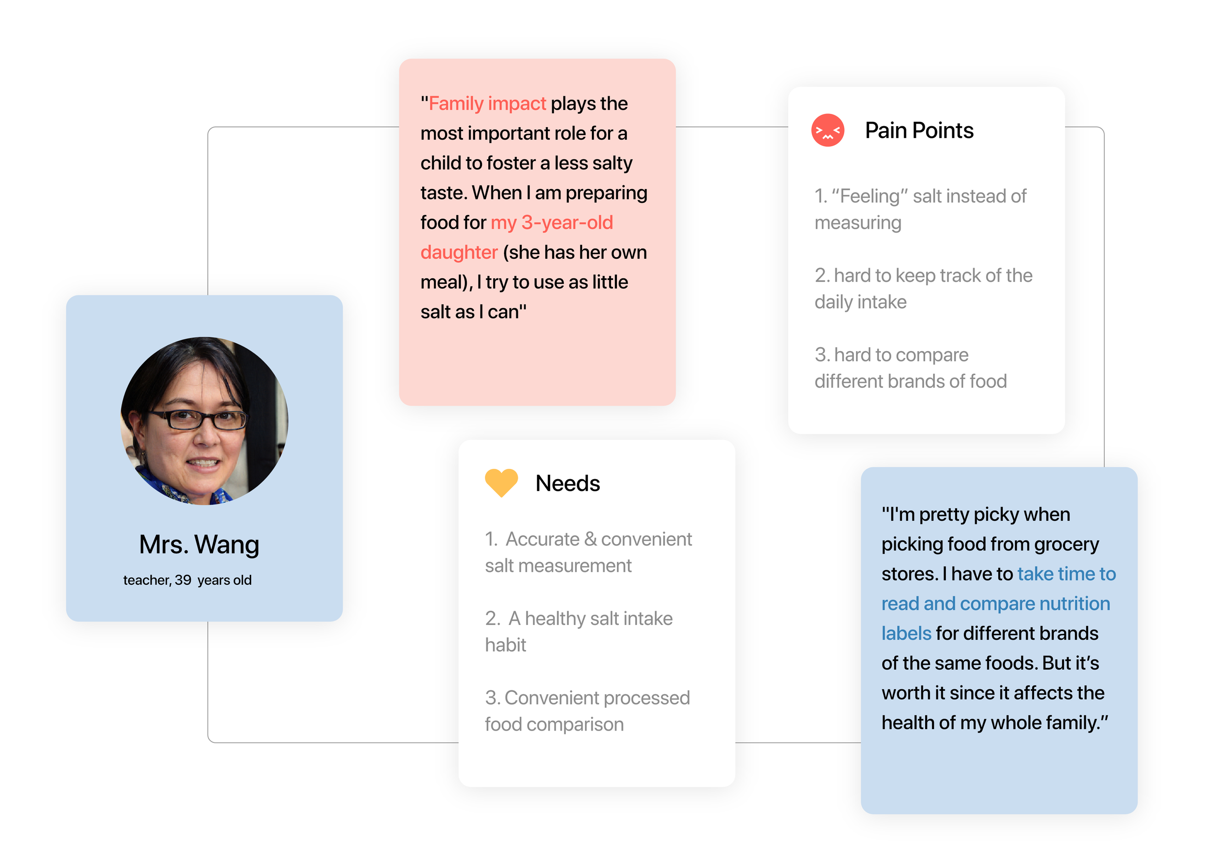
This group is the most motivated to reduce sodium — often managing health conditions for themselves or family members — but the cognitive overhead of real-time label math during a busy grocery run or cooking session makes consistent tracking unsustainable.
After roughly three months of reduced sodium intake, taste receptors adapt. Food that tasted bland starts to taste normal, and previously normal food starts to taste overwhelmingly salty. This is why long-term reduction is sustainable once the habit forms — but it requires getting through the first 90 days. The design needed to make that period feel achievable.
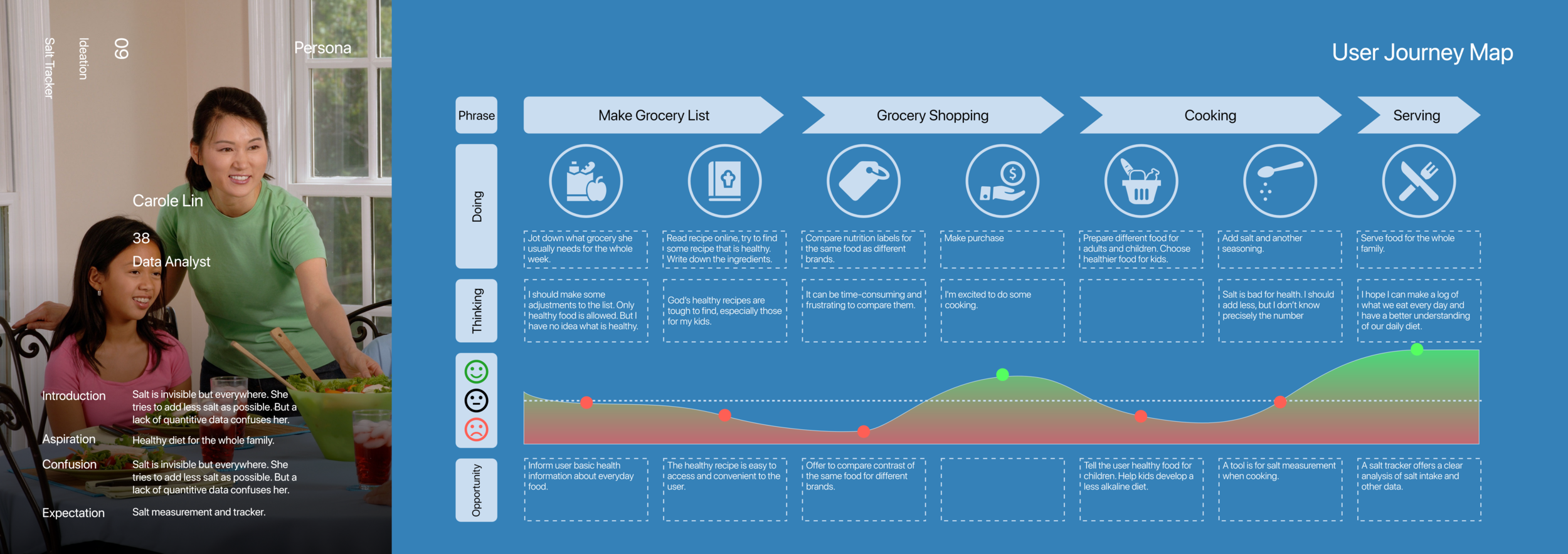
Research was synthesized into a primary persona and user journey map to identify where the biggest friction points were — and where design could make the most difference. The journey map traced the user's experience from discovering a health concern through forming a daily tracking habit, revealing three high-friction moments: grocery shopping, reading nutrition labels, and sustaining motivation past the first two weeks.
How might we help users track and reduce sodium intake in a way that fits naturally into their daily routine — without requiring nutritional expertise?
Starting from the HMW question, I mapped out the full information architecture and core user flows — establishing the four-tab structure, the logging path, and how recipes and stats connect to the daily motivation loop.
Early wireframes explored how to structure the daily view, the step-by-step logging flow, and the stats visualization — before committing to any visual direction.
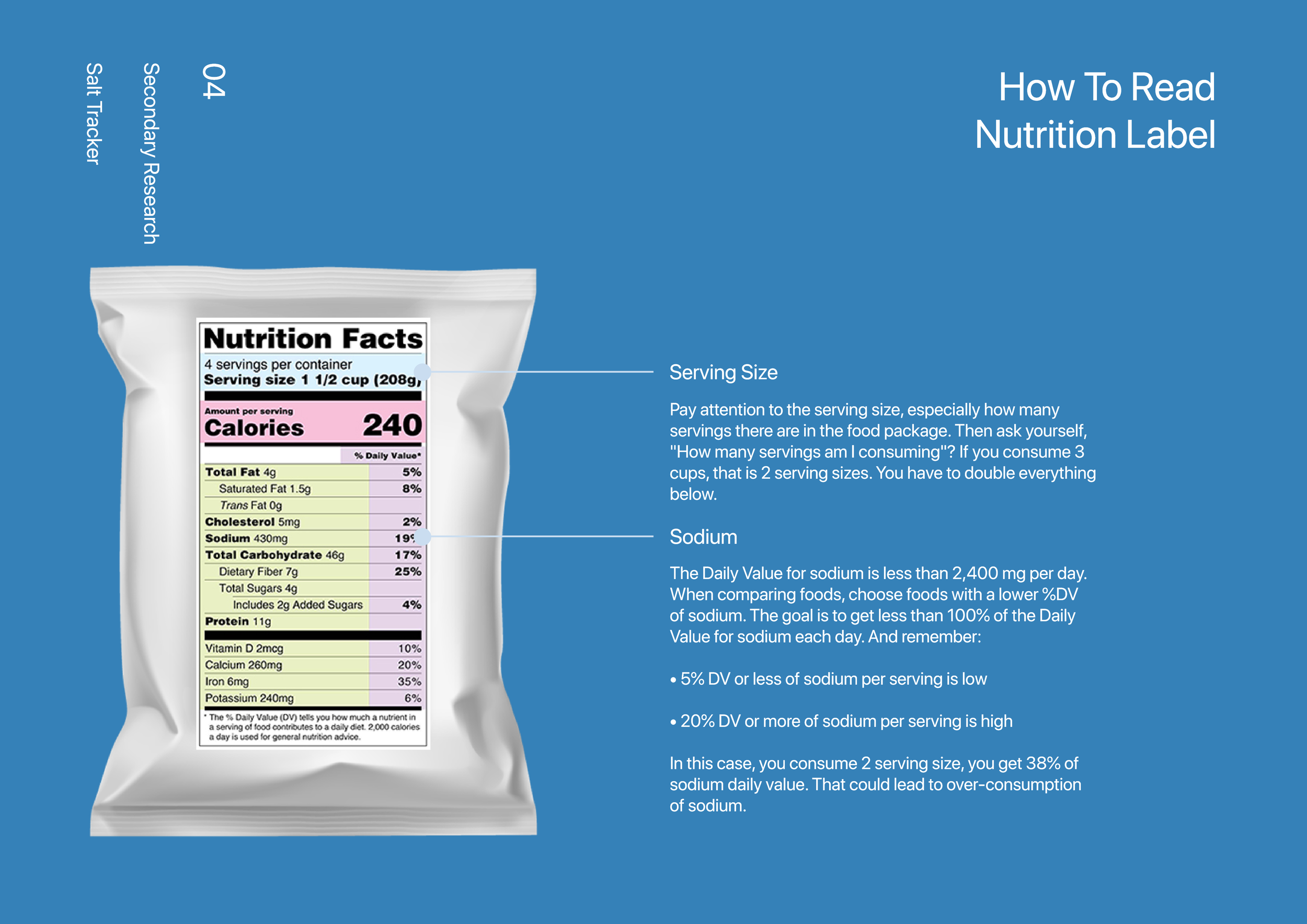
Interviews revealed that users — especially working parents — do consult nutrition labels but find the raw data too dense to act on in the moment. This directly informed two design decisions: presenting sodium as a simple daily budget rather than raw milligrams, and designing the NFC tap feature to surface a single, personalized rating instead of raw numbers.
Usability testing was conducted on the wireframe prototypes — before final visual design — to validate core flows and surface friction early, while changes were still cheap to make.
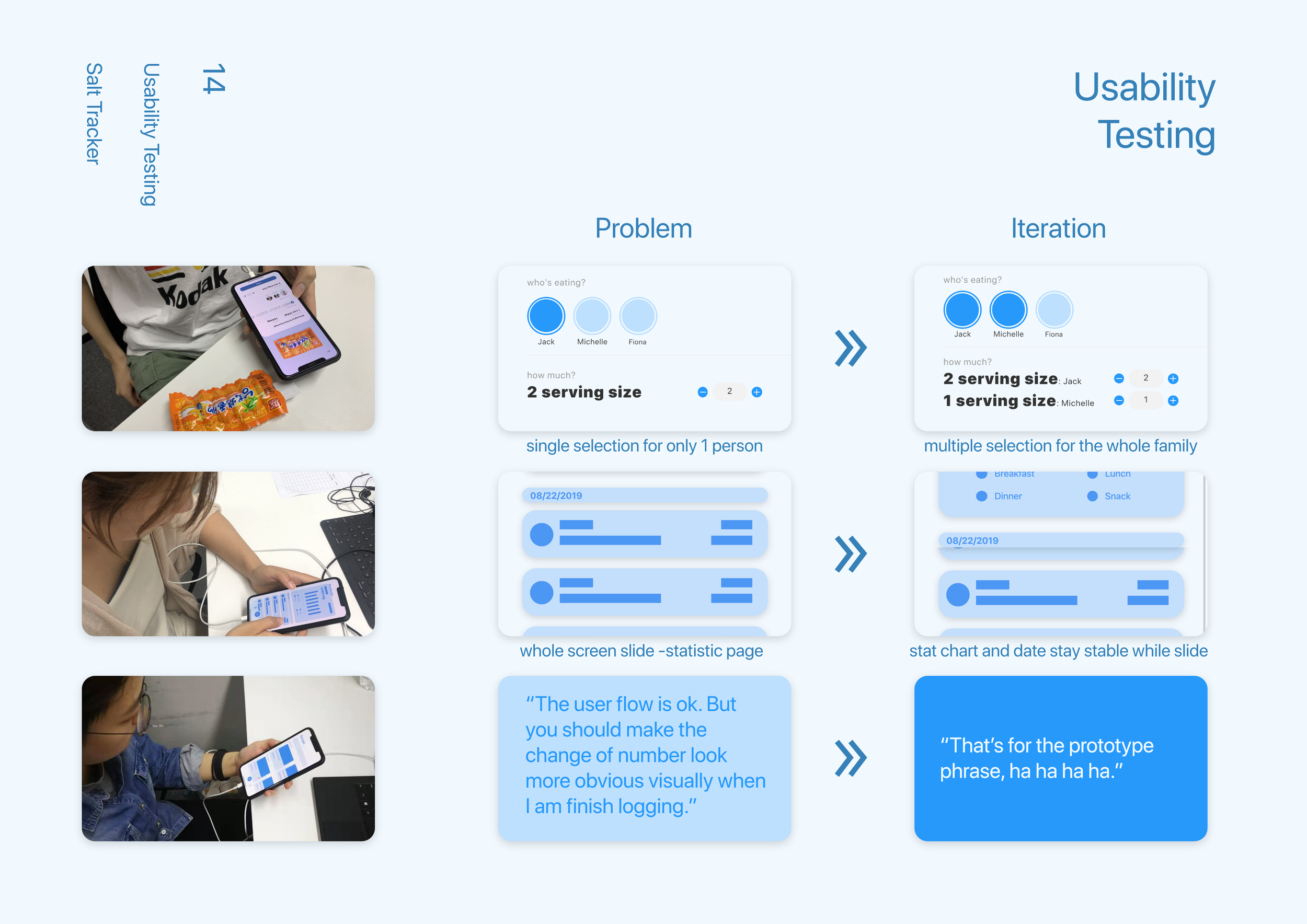
All participants completed the logging flow successfully. Most finished in under 30 seconds by the second attempt — validating that the step-by-step structure was clear enough without instruction.
Participants understood it quickly but not immediately — they needed a moment to realize the shaker represented their remaining daily allowance. A one-time tooltip resolved it in all subsequent tests.
The meal-type breakdown generated the most positive reactions. Several participants said it was the first time they'd seen their eating patterns presented clearly — calling out specific meals they hadn't realized were problematic.
Minor copy and onboarding adjustments based on findings; core structure validated. Moved into visual design without structural changes.
The 85% perception gap was the most clarifying finding I've worked with. Once I understood that users weren't unmotivated — they were just missing accurate feedback — the entire app architecture became obvious. Design for visibility first; motivation follows.
The salt shaker was the most positively received element in testing — and the one that needed the most onboarding. The lesson: great metaphors earn their explanation cost. Don't abandon a strong concept because it needs a tooltip; make the explanation as lightweight as possible.
Designing the NFC grocery extension pushed me to think beyond the screen. The realization that 77% of sodium decisions happen in a supermarket aisle — not the kitchen — reframed the whole problem space. The best health product isn't always a phone app; sometimes it's a touchpoint that meets people at the actual moment of decision.