
Overview
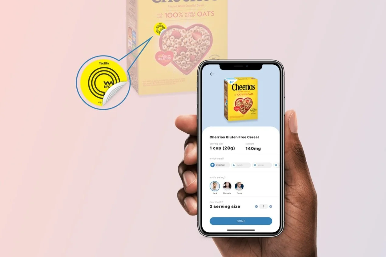
Over the summer of 2022, I worked as a UX Design Intern at the S&C Design System team. Specifically, I designed the end-to-end component usage dashboard and an example web app for testing. I also designed the data visualization components series and three mobile components. All of my work has been shipped either during or after my internship. It was truly a fruitful summer.
Note: everything showcased here is my individual work with great feedback from the team!
Duration
May 2022 - Aug 2022
Role
UX Design Intern
Tools & Methods
Figma, Atlassian Suite (Jira & Confluence), Interview, Survey
Timeline

How I (we) work & communicate
Our team adopted the agile software development method where every two weeks is a sprint. During every sprint, I need to finish 1-3 tickets (tasks). Every day we would have a daily stand-up to share our progress and any potential obstacles. Every week, we have a design/dev review meeting where everybody presents their work and gives feedback. By the end of the sprint, we would have a sprint demo session where all interns will present their final results for this sprint. I also have a 1-on-1 with my mentor every week. I also scheduled meetings whenever I felt the need.
My workflow with an example task: component usage dashboard
1️⃣ Project context
While S&C has implemented the design system for years, there was still no platform to monitor component usage to inform developing priorities. In later 2021, the design system library was transferred from sketch to Figma which has a dashboard for components adoption. However, it only focuses on the design side and the team also has an interest in seeing how things work from the development side. Thus, a dedicated dashboard is needed for this specific need and I was tasked to design the dashboard from 0 to 1.
2️⃣ The process
-
From the ticket description, I can only understand what I need to design which is a dashboard. And the only reference my manager gave me was the Figma library usage feature and a component code file. I was confused by the reasons for developing this dashboard since Figma already has the feature. By communicating with my manager, I was able to understand an important point which is that the dashboard is to monitor the component usage from the coding side rather than from the design files side. → monitor component adoption from the coding side
-
With this important insight, I knew I needed to do some user research with the developers. By interviewing the development team was able to understand the context of how the component coding works and most importantly, what data is available for this dashboard and what is the most important data to monitor. These interviews gave me many great insights. However, I also realized an important challenge of this task: the data we have is very limited, and it is not sufficient for the team goal. So what do we do? We negotiate. I facilitated the meeting with my manager and the development team to figure out what data we currently have, what data we could have but need time and effort to do so and what is simply impossible. Then my manager would decide on what data we should work on to get based on team goals. By doing this, I finally had the edited reality-based goals and confidently know the data is available from the coding side.
-
I researched and got some great insights about the best practices of the general dashboard. However, there was not too much information about component usage monitors specifically which became my design goal: to present data with limited information.
-
Happy designing 🥰
-
I received very positive feedback on the overall design with some suggestions to work on. I also got validation from the development team that all my design was feasible.
-
I worked on those suggestions and made some tweaks to the design
-
I made the final presentation in our sprint demo session to the whole team and the VP.
-
I made documentation as Confluence documents with design specs, feature descriptions, resizing behaviors, edge cases, etc. I also organized the Figma file to have a dedicated page for design handoffs so developers can quickly refer to the design when they develop.
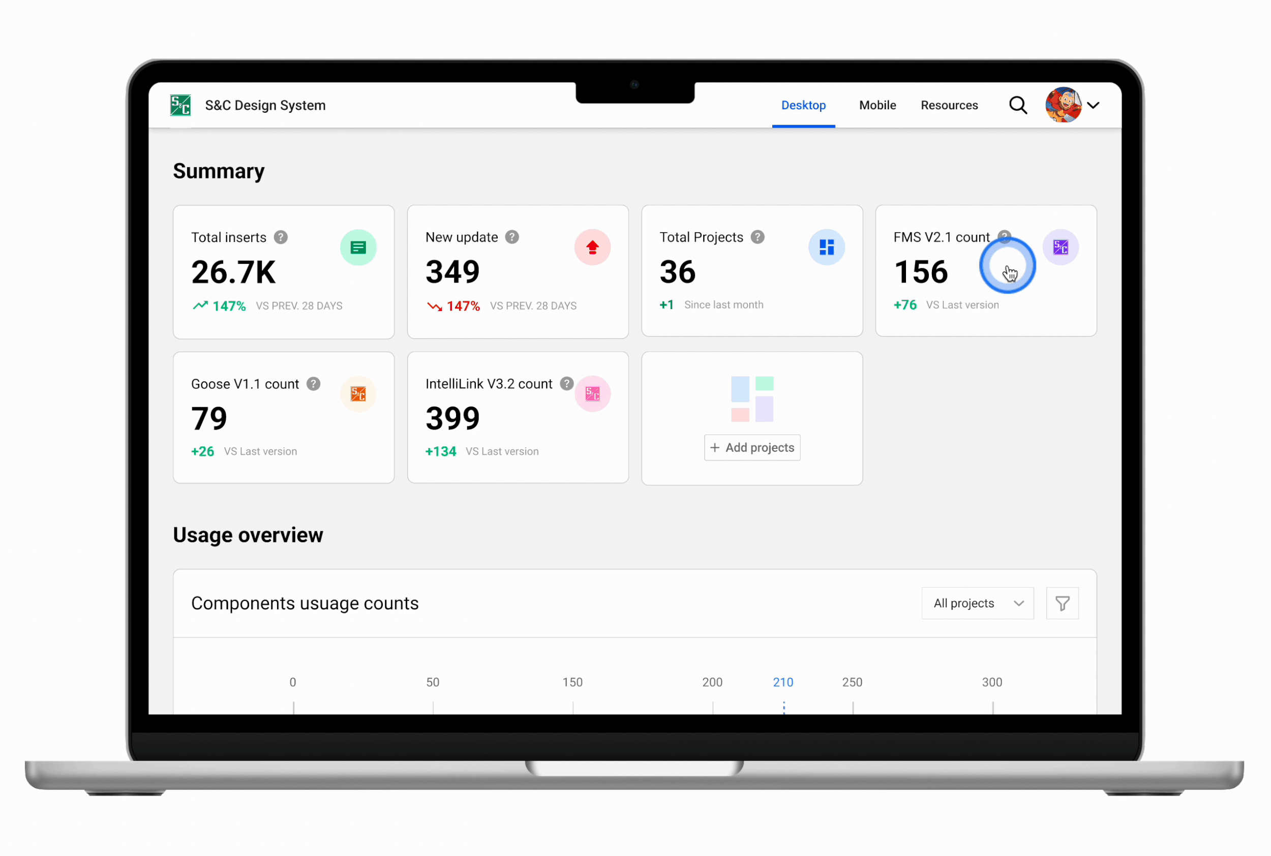
3️⃣ THE RESULTS

Dashboard - info at a glance
The dashboard has a section for summary card components that display important insights such as component inserts, trends, and project overviews. It also has sections for component usage charts.
View detail by project
By clicking on the project summary card, a modal will pop up which would have information about what components are being used in this project as well as the component props usage and the file locations.

View details by component
By clicking on the component item label on the bar chart, users can see what props are being used by what project. They can also see the detailed use cases of every project.
Other projects
Data visualization components

Chart container - stacked bar chart
The chart component has the following functions:
Time range selector: this allows the users to display the chart according to their interests in the time range.
Navigation selector is a small series below the main series, displaying a view of the entire data set. It provides tools to zoom in and out on parts of the data as well as panning across the dataset

Pie chart
Filterable data: Clicking on legend items (or by some other filterable means) should toggle the visibility of the clicked series.

Empty state
take a break :)
Example web app for testing component updates

Device overview dashboard
Used and modified components: global navigation, device info card, data table

Device info page
Used and modified components: sidebar navigation, summary card
Newly designed components: device state info, configuration card

Settings
Used and modified components: sidebar navigation, input box, dropdown menu, global navigation
Newly designed components: color selector, settings container
Mobile components

Input field
The input field component has different variants for different states and toggles to turn on and off icons before and after the text field.

Dropdown menu
Instead of using the traditional dropdown menu where the menu is right below the input field, I used the bottom sheet format for better reachability and larger action areas to increase accessibility.

Icon component
Outline and filled versions of icon components with icons downloaded from Nucleo. I modified the icons by changing the weight, visual prominence and shape to make them more balanced.
The payoff
We increased efficiency by applying the structured design thinking process to the design system. The clear documentation and design handovers also result in less back and forth between designers and developers and reduced friction. They also provide guidelines for designers when using those components.
Takeaways
This 12-week internship was truly a gift to me. I am so grateful for this opportunity and I learned a lot of skills during that time. Looking back, 12 weeks ran so fast but it made me a way better designer after this internship. And more importantly, I am more sure now that UX design is where my passion at, and I am ready for it!
What I did well
The quality of my design work: although it could always be better, I was quite happy about the deliverables I gave during my internship. During my mid-term reviews, my manager gave me the full mark for the quality of my work and specifically complimented it! I am very grateful and encouraged. It meant a lot to me!
Observing & learning from my team: by simply observing how my team works and communicates, I was able to learn a lot such as communication, giving & receiving feedback, and presentation. I also learned many Figma tricks and skills from my mentor, Ann, who is the Figma Guru of our team!
Research, a lot: I put a lot of effort into doing research of learning more about the problem, understanding the context, or simply learning the best practices instead of rushing into the design which I was always tempted to do. It really paid off and saved me a lot of time.
What could have been better
Getting feedback from the earlier stage: I always had the mindset that I should only show my work when it is very polished and thought out. Sometimes, this worked. Other times, it just didn’t. When it did not work, I had to do much extra work which could have been avoided if I had shown them the MVP of my design idea even if it looked ugly, and asked for feedback at the earlier stage.
Documentation: before this internship, I was more familiar with the Chinese way of the software development process which it is quick and dirty. We do not really have documentation or will only have minimum documentation after everything is finished. It was another UX design intern, Audrey, who showed me the power of documenting everything throughout the whole process. Since then, I documented many things but still not enough. Besides, since I was kind of new in this area, it took me more than average time to document things. I would focus on improving my documentation skills.
Communication tricks and skills: as mentioned earlier, I learned a lot and did well in this aspect. They are also many things I could improve upon such as the language/vocabulary to use during certain situations since English is not my first language. I also wish to improve upon my small talk skills since I was not familiar with small talk cultures as a Chinese.