Overview
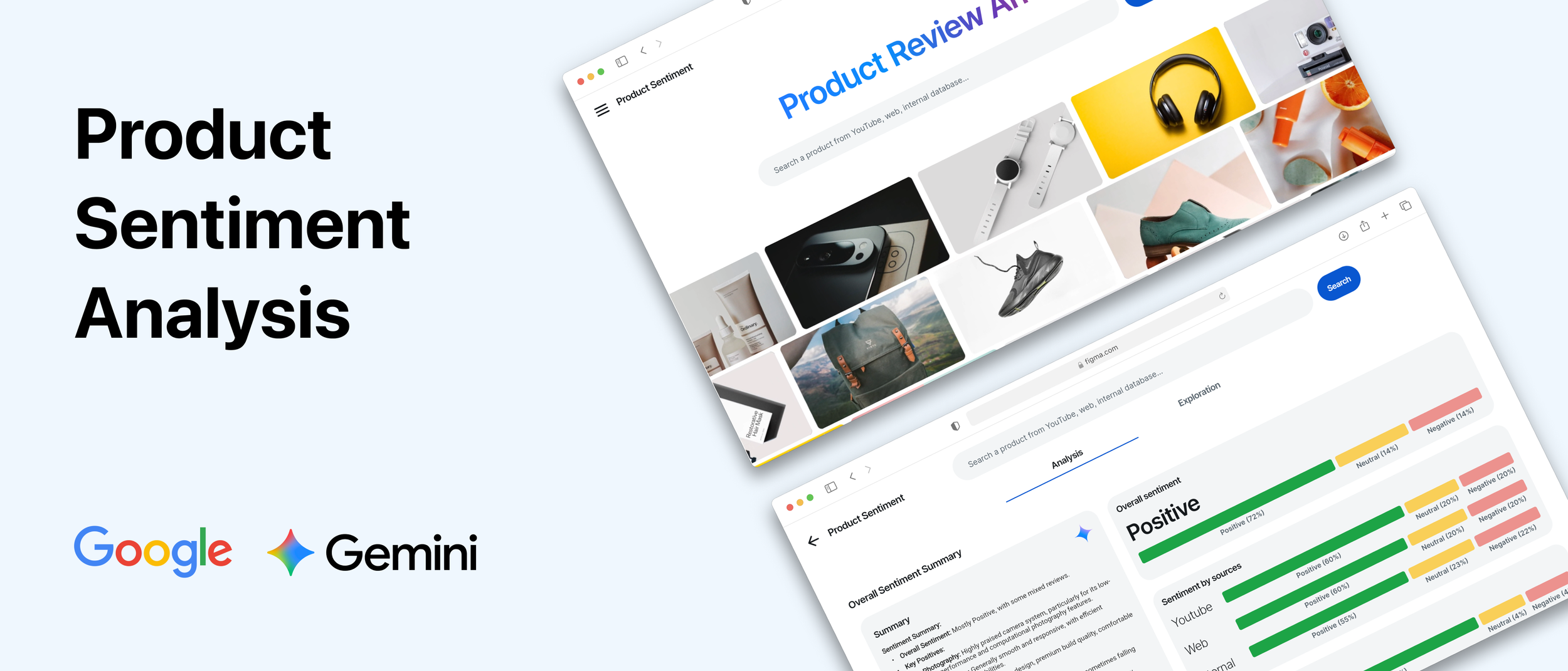
Google, a leader in artificial intelligence, needed a compelling demo for an exclusive conference attended by C-suite executives from top global companies. The goal was to showcase Google’s AI model - Gemini's powerful ability to understand and analyze product sentiment from diverse data sources.
In an extremely tight two-week timeline, I led the end-to-end UX/UI design and front-end development (using a low-code tool) for this high-visibility demo. The final product, "Project Sentio," was a resounding success, capturing the audience's attention and generating significant post-conference interest.
Duration
2 weeks
Role
Lead UX/UI Designer
Front-End Developer (Flutterflow)
Project Manager
Team
Front-end: Pitchhub (Cognizant & Google)
Back-end: Google Cloud Gen AI Team (4 engineers)
Status
Shipped ✅
THE TASK
How might we effectively demonstrate a complex AI model to a non-technical, executive audience in a short, live presentation?
The engineering team had a powerful AI model but needed a user-centric application to bring its capabilities to life. The demo had to be:

Clear & Compelling
Immediately communicate the value proposition of analyzing product sentiment.

Impressive
Showcase the AI's ability to process varied data types (internal data, YouTube, web content).

Action-Oriented
Conclude with a “wow” moment, like generating marketing assets based on the AI's insights.

Feasible
Be designed, built, and polished in an intense two-week sprint for the CEO's office.
Solution overview
From Search to Insight to Value Generation
I collaborated with Tipaipai's product manager, designers, engineers, QA, and marketing team to revamp the Tipaipai onboarding process. The updated version was successfully launched, resulting in an increase in retention rates to 55%. We are optimistic about continued growth in the future.
Homepage — First Impressions Matter
The vibrant, moving carousel of product images serves as a visually engaging backdrop that adds a premium feel and hints at the "product" focus of the tool without distracting from the primary call to action.
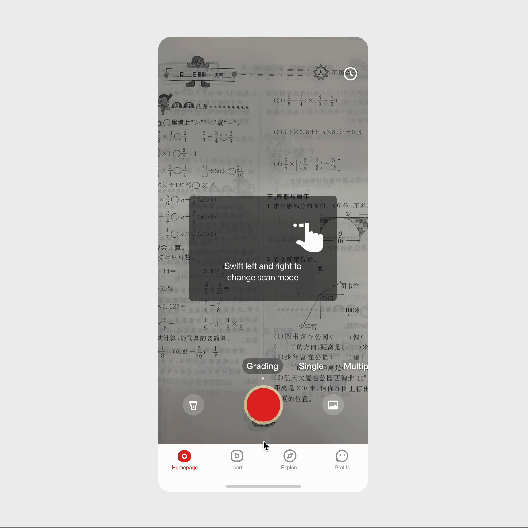
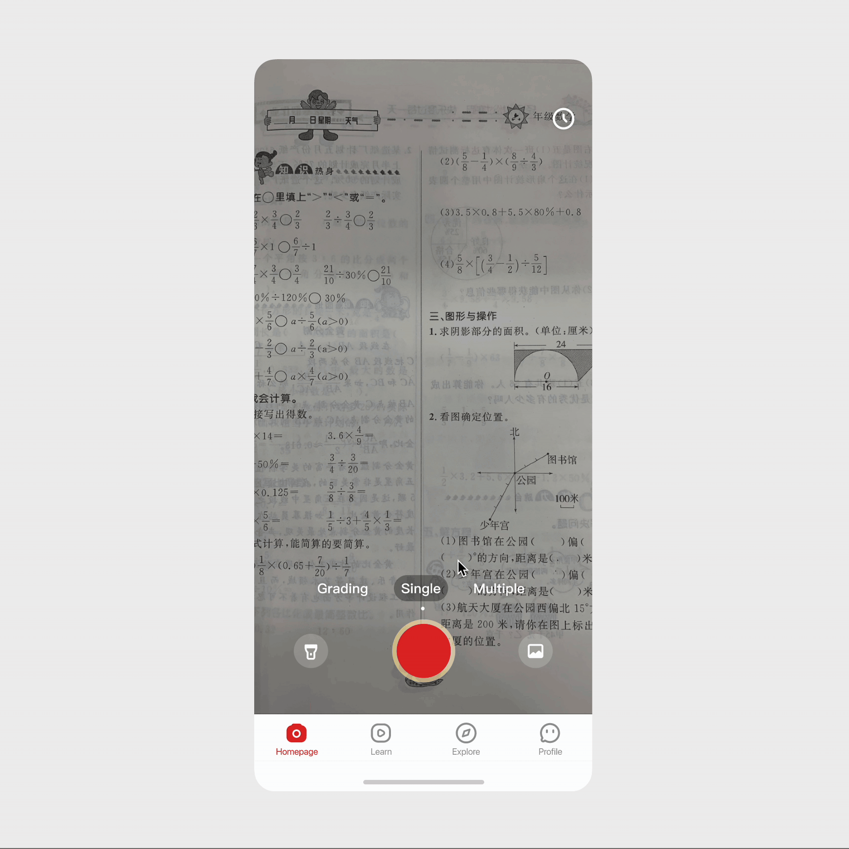
Interactive walkthroughs
Each small interactive walkthrough or tooltip is offered as a one-time dismissible modal that can either explain the value of that feature/section or explain how to use it.
Ask for information at the right time
We ask for necessary user information at the right context. For example, we prompt users to enter grade level for content customization when they arrive at the explore page.
RESEARCH
What does the data say?
Insight #1. Students don’t like it when we ask for permissions or personal information, especially at the wrong time
My team and I meticulously analyzed the data to pinpoint the exact stages at which user engagement dwindled: substantial user drop-off occurred at the tracking & notification permission screen (14%), alongside the "enter grade level" screen (11%).
Insight #2. Half of the first-time users didn't return. 29% took random pics, resulting in low-value perception.
Examining images submitted by these users during quiz searches revealed an unexpected trend: many unrelated shots, like floors and desks. We deduced users downloaded the app for diverse reasons – app store browsing, ads – aiming to explore features rather than quizzing right away.

Random pics users submitted 😭😭😭
What do the users say and do?
Insight #1. Our survey suggests that 58% of the users were not doing homework when they first downloaded the homework helper

Pop-up survey banner designed by me 😊
To validate these assumptions and gain deeper insights into user behaviors and preferences, we initiated an extensive round of user research. Initially, I interviewed 5 "churned" users, who hadn't revisited the app within a month after their initial trial. Below are excerpts from their interviews:

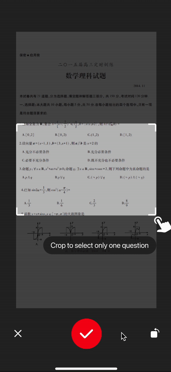
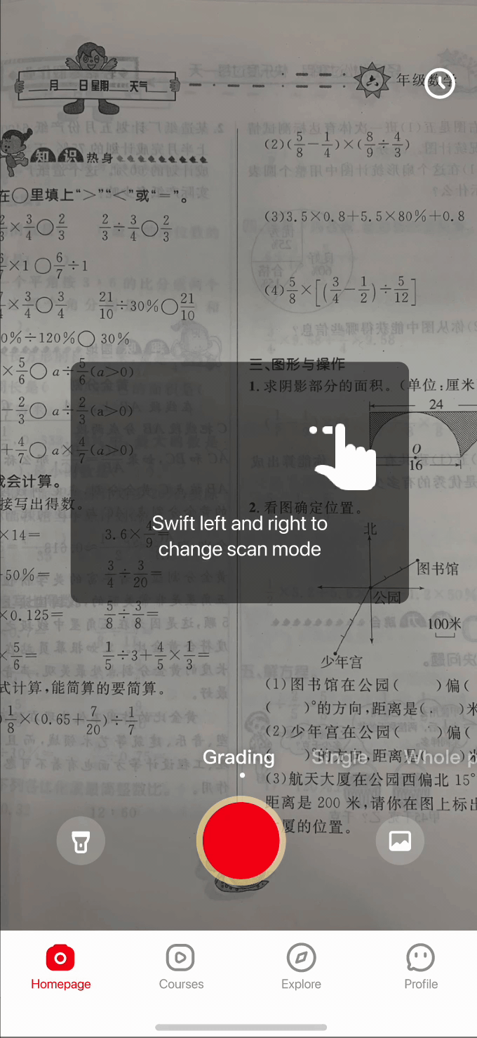
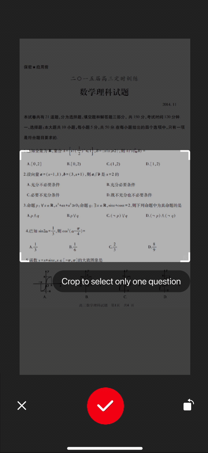
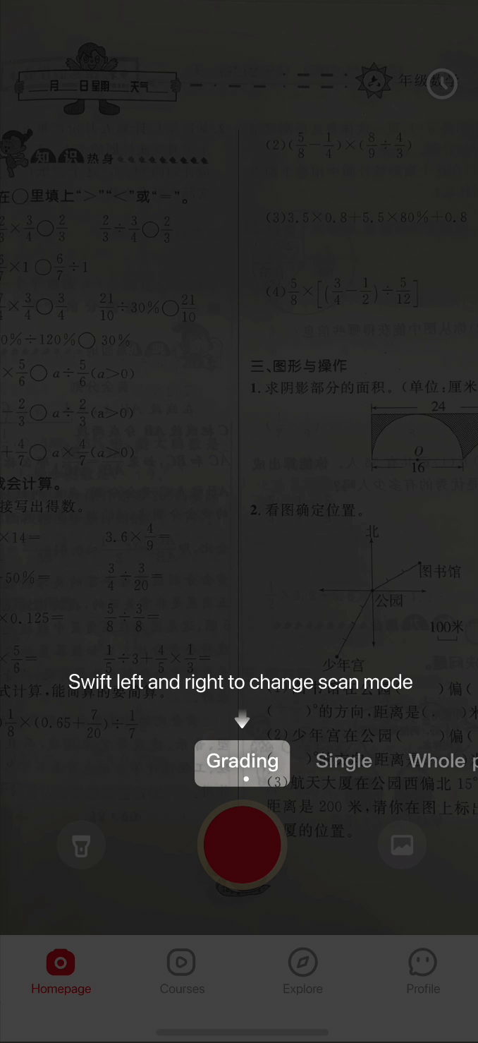
Insight #2. Usability testing shows users need guidance on switching search modes and cropping photos.
I then proceeded with semi-structured usability testing involving 6 students, tasking them with completing the onboarding process and interacting with the app. During these sessions, notable observations emerged:
2 students encountered difficulties cropping pictures in the single-question search mode.
3 students exclusively utilized the default search mode, neglecting mode switching entirely.
2 students remained unaware of the existence of different search modes.
💡Problem Breakdown & Solution
1. Users don’t capture homework pictures upon initial app use due to non-homework contexts. → Offer a demo for them to explore.
2. Significant user loss stems from premature permission and information requests, preceding product value perception. → Request permission contextually.
3. Search modes suffer from poor discoverability. → Implement interactive walkthroughs.
4. Numerous users are unaware of, or unsure how to, crop images. → Implement interactive walkthroughs.
THE DESIGN
Feature #1. Homework demo design iteration
I refined the demo experience through several iterations, incorporating feedback from my nephews, who participated in my semi-formal playtesting and usability testing sessions.
👇 Iteration 1. Don’t make another social media app
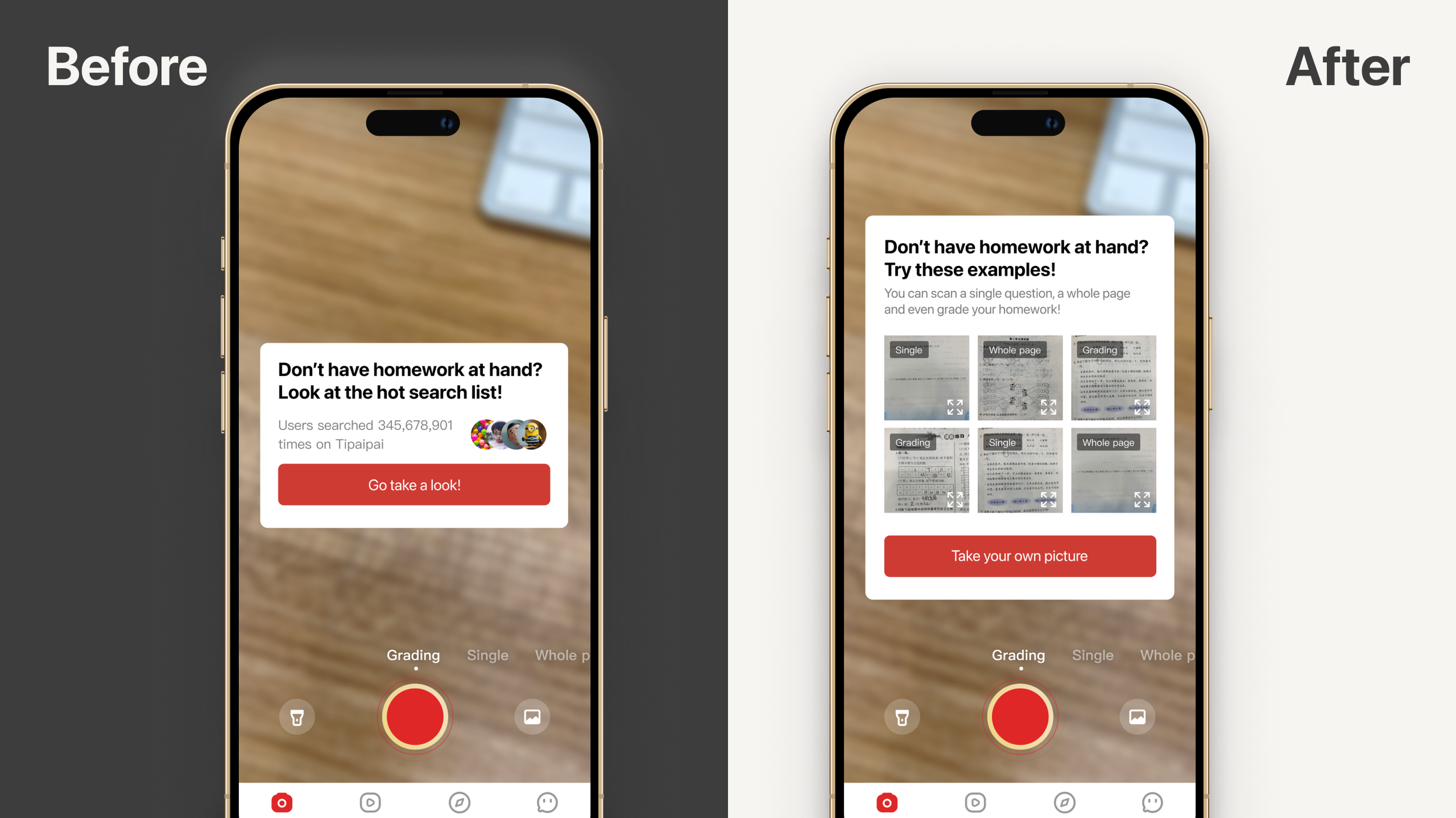
During the testing session, my nephews displayed some confusion regarding the design of the hot search list and demo list. However, they easily grasped the straightforward design and successfully completed the tasks. Notably, they questioned the purpose of the hot search list. Taking this feedback into account, I opted for a new design featuring cards presenting various homework samples for users to choose from.
👇 Iteration 2. Avoid decision fatigue
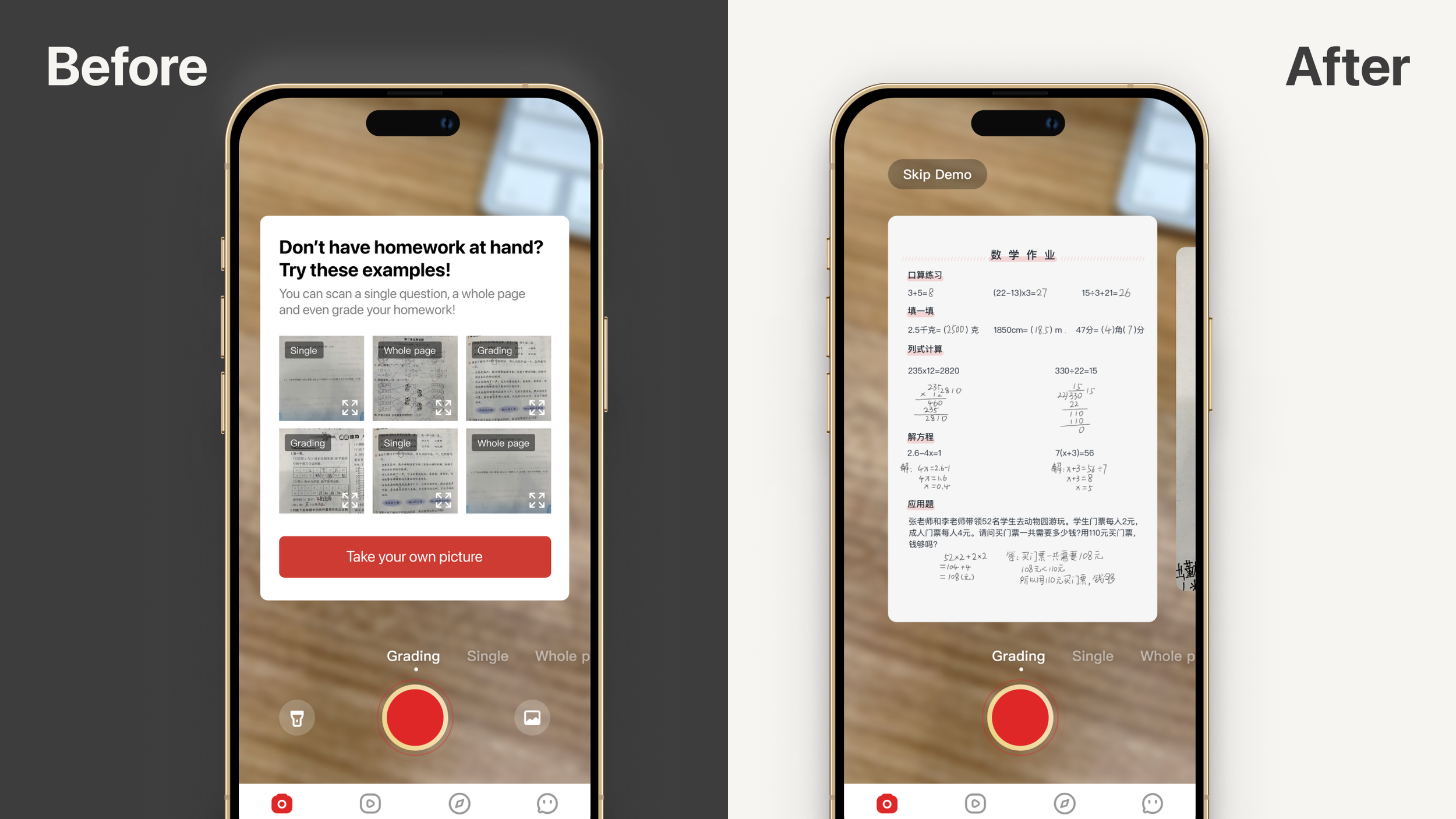
While the demo list initially offered various demos and the chance to explore different search/scan modes, participants experienced decision fatigue during the session. They often paused on the screen for extended periods. To address this, I introduced a version that directly presented a single sample while still allowing them to swipe to change modes, eliminating an extra step in the process.
👇 Iteration 3. Fine tuning details
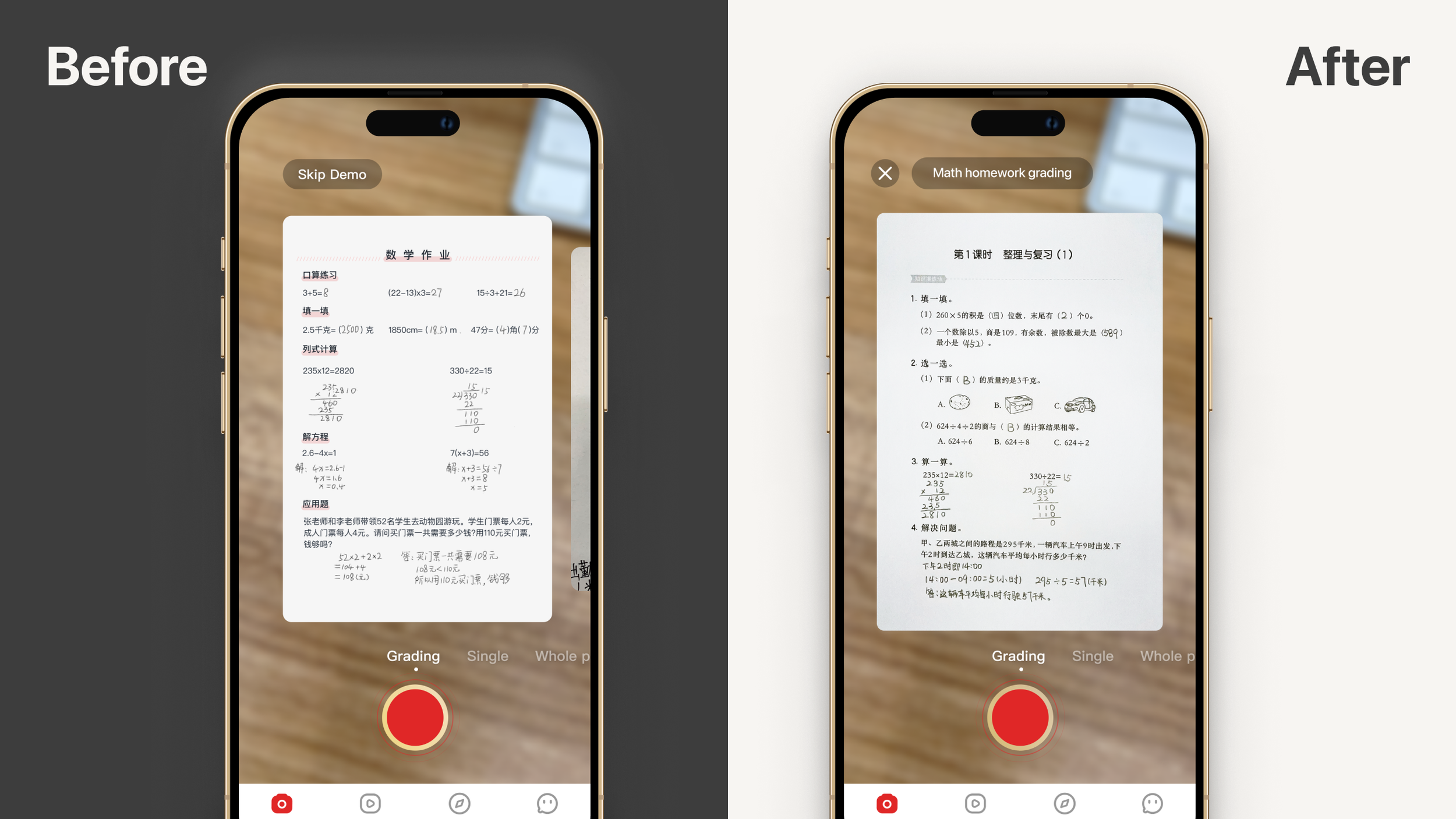
Initially, I used a carousel design enabling users to swipe and choose samples linked to specific modes. Yet, this feature went unnoticed by most and caused decision fatigue for those who did. In response, I streamlined the process, offering just one sample per mode. I also added mode-specific titles to highlight their value.
Feature #2. Interactive walkthrough visual explorations
Top: cropping image tutorial
Bottom: switch search modes tutorial
Exploration 1: Cartoony Gestures
Pros: Direct and straightforward, likely appealing to younger students.
Cons: Doesn't align with our minimalist branding and design principles.
Exploration 2: Subtle Visual Effects
Pros: Minimalist and aligned with our design principles and branding.
Cons: May be less intuitive, especially for younger students.
THE IMPACT
Onboarding completion rate increased from 46% to 69%; the next-day retention rate from 23% to 55%.
A mere two weeks after the launch of the updated version, we witnessed the onboarding completion rate surge from 46% to an impressive 69%. Simultaneously, the retention rate experienced a significant 32% improvement, escalating from 23% to an impressive 55%, even though the onboarding process had been slightly extended.

What I Learned 🌱
User interest diminishes rapidly, emphasizing the need to communicate your product's value within the initial screens.
Avoid assumptions; test even if the concept isn't fully developed or formal. Leverage connections to gather crucial early-stage feedback.
Embrace iterative processes. Avoid becoming overly attached to initial ideas. Explore solutions that might not be immediately apparent.