An internal tool to monitor design system health — designed in 7 days under significant data constraints.
Design systems are only as valuable as their adoption. S&C Electric's Design System team had built a strong component library — but had no way to answer a basic question: is anyone actually using it?
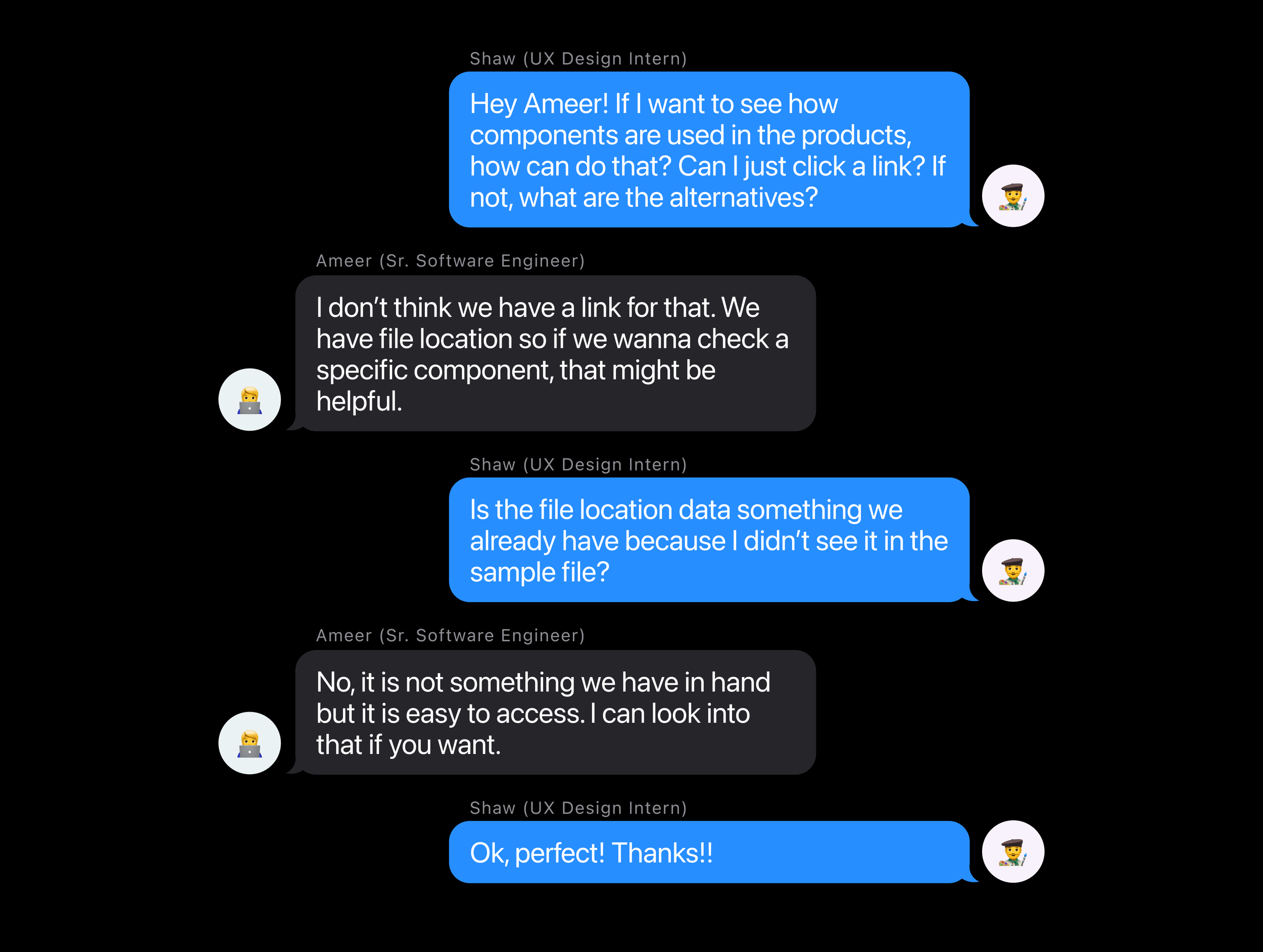
I was assigned this as a single sprint ticket within a 2-week cycle at my internship. The requirements doc was blank. The data was scattered. And the answer to "where do we even get the numbers?" took two stakeholder conversations to figure out.
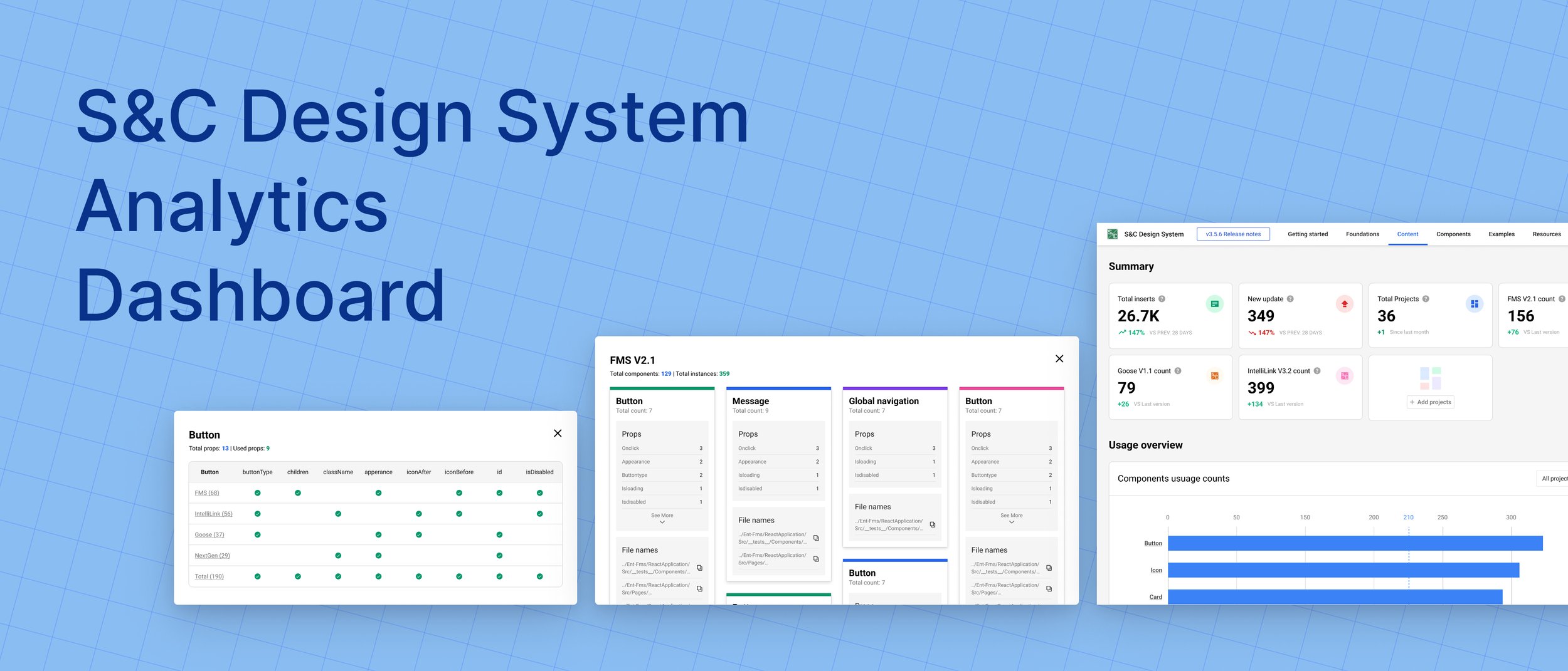
The result is a single-page dashboard that pulls from multiple alternative data sources to give the team a continuous picture of component adoption, detachment rates, and team-level usage — the visibility they needed to prioritize roadmap decisions.
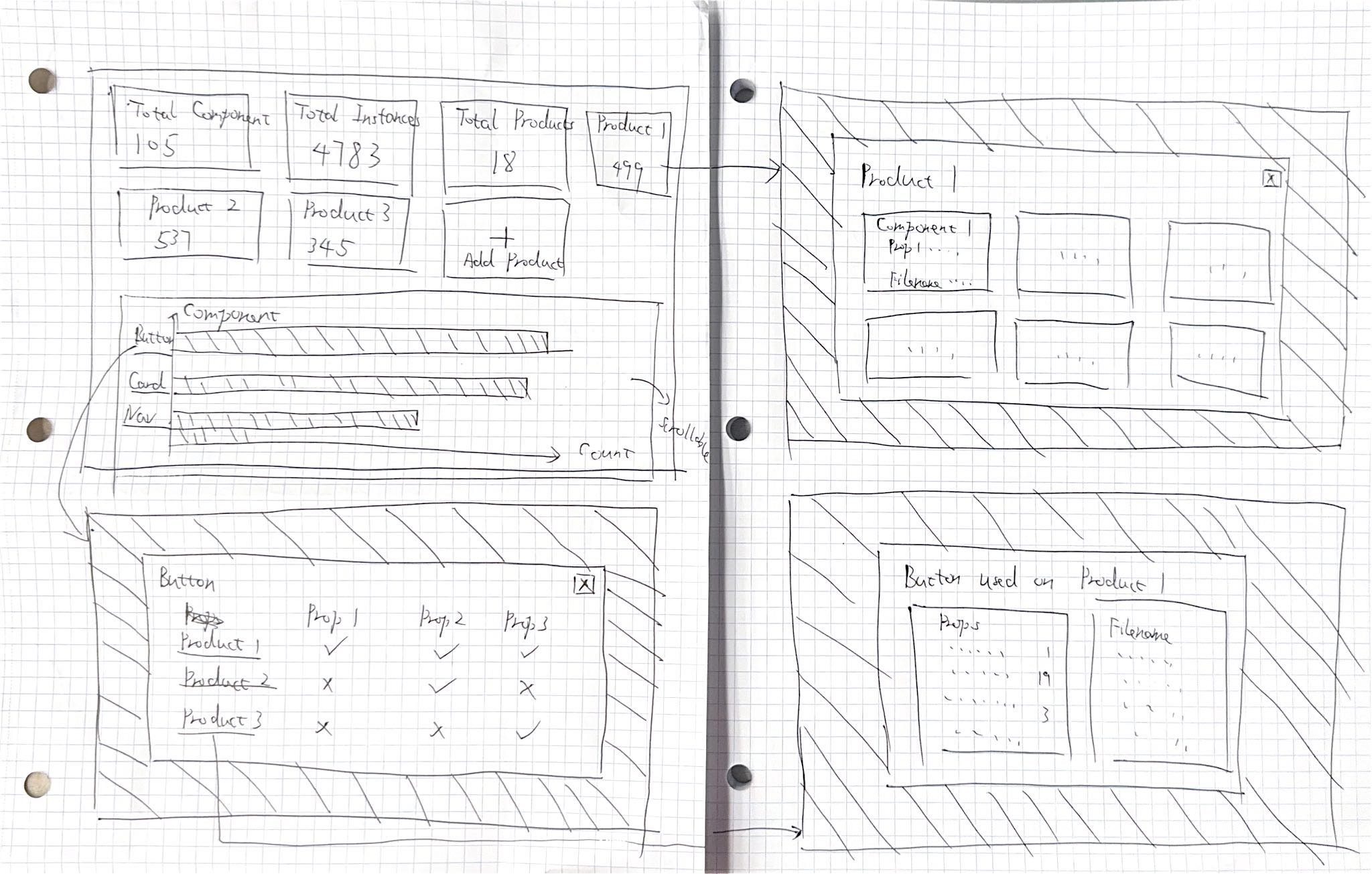
The dashboard is organized into three interconnected views: a high-level summary, a product-by-product adoption breakdown, and a component-by-component usage analysis. Together they answer both the "are we healthy?" question and the "where should we focus?" question.

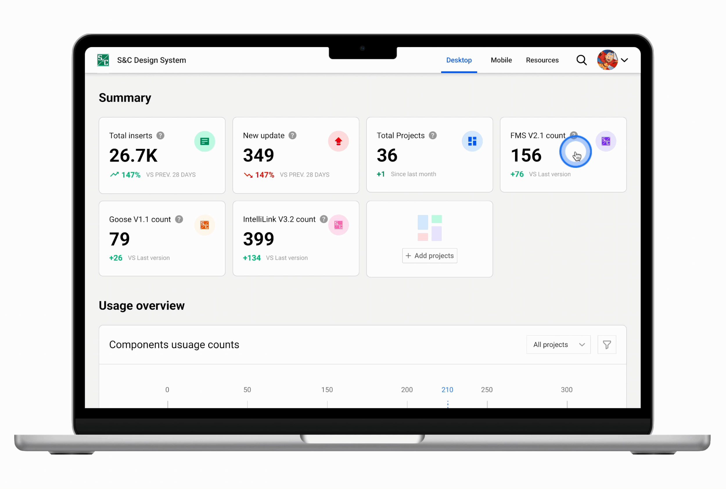
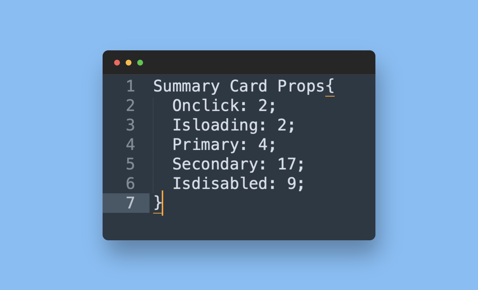
The top-level view surfaces summary cards for overall adoption rate, total component usage, detachment rate, and active contributors — giving design leads an instant read on whether the system is growing, plateauing, or declining. A timeline chart shows adoption trends across the quarter so changes can be correlated with team events or new component releases.
The product breakdown answers a key stakeholder question: which product teams are actually adopting the design system, and how intensively? Bar charts compare adoption rates across product lines, making it immediately visible if a particular team is lagging — prompting a targeted conversation rather than a broad guess about where to focus enablement efforts.
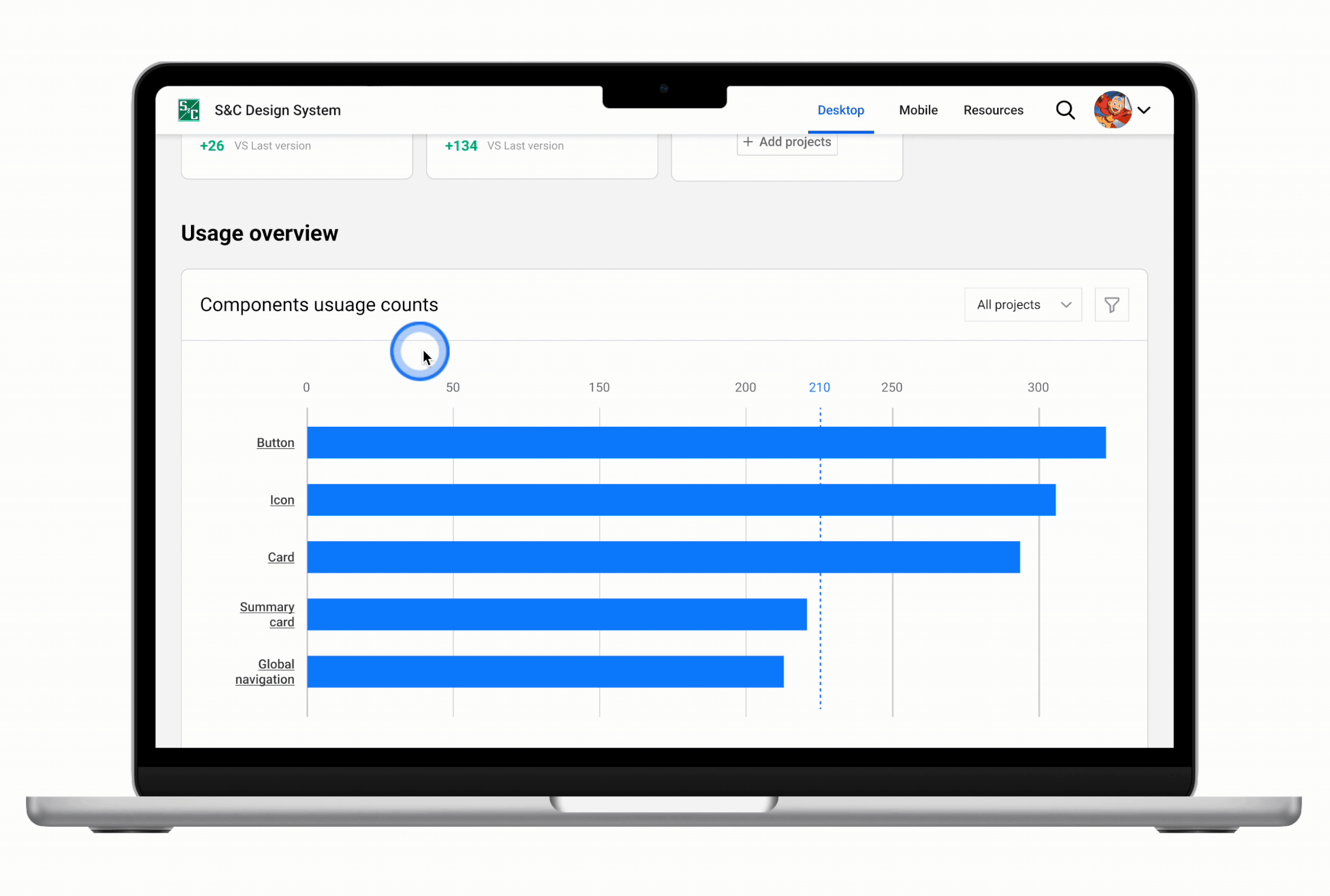
The most actionable view for the design system team: a component-by-component matrix showing usage counts, detachment rates, and variant selections. A high detachment rate signals a component that's being used as a starting point but not staying in sync — a direct flag that the component needs to be redesigned or better documented to fit real use cases.
S&C Electric's Design System team was flying blind. The component library was being consumed by product teams, but the team had no reliable way to know which components were popular, which were being detached, or which teams were actually adopting the system versus copying it one-off.
Without this visibility, roadmap decisions — which components to build next, which ones to fix, where to invest documentation effort — were based on gut instinct rather than evidence.
How might we monitor the success and health of S&C's Design System with limited data availability?
Before touching a single frame, I ran stakeholder interviews with management to understand what questions the dashboard needed to answer. The goal wasn't to design a dashboard — it was to surface the decisions the team was currently making blindly, then design exactly the visibility they needed to make those decisions well.
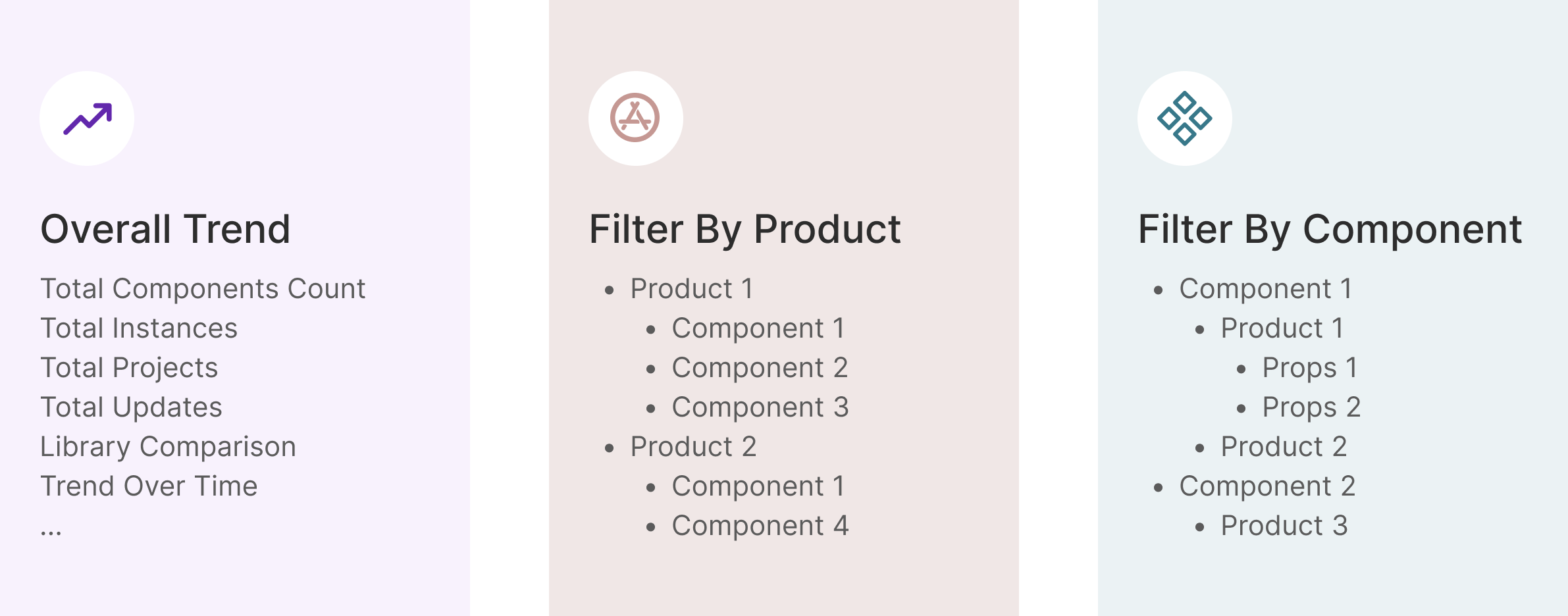
Six distinct use cases emerged from the research, each one representing a question the team needed to be able to answer on demand.
Find out which components are used most frequently across all products — to validate roadmap priorities.
Identify components that are frequently detached — a signal the component doesn't fit real design needs and needs to be reconsidered.
See how collaborators use specific variants — to understand which design options teams actually reach for in practice.
Surface components that exist but are rarely used — either a discovery problem, a documentation problem, or a fitness problem.
Compare adoption rates between two component libraries to inform decisions about which library to invest in and which to deprecate.
See which product teams are using each library — to identify who needs enablement support and who can be case studies for wider adoption.
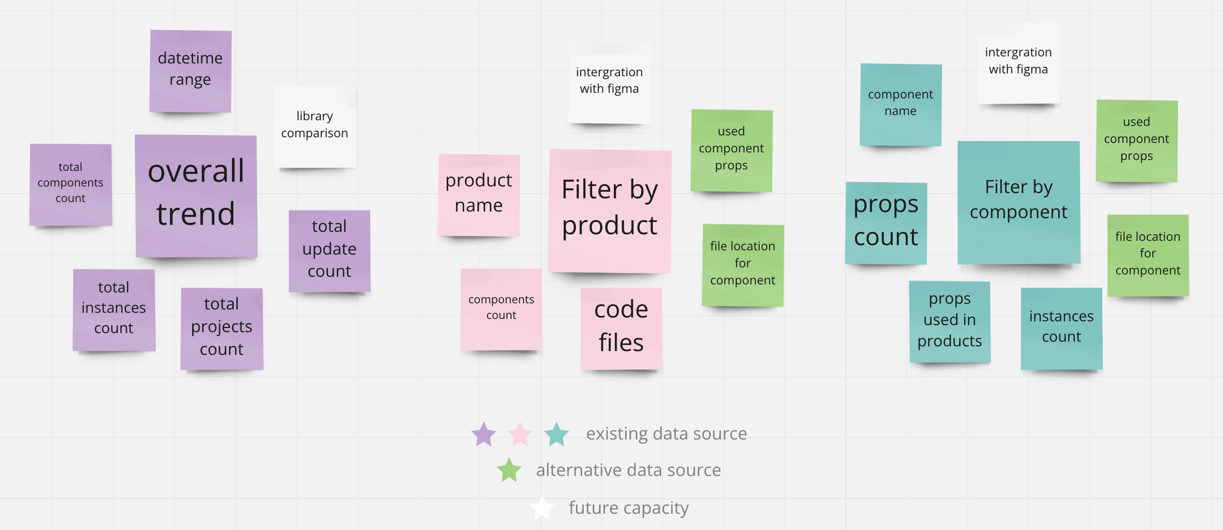
This is where the real constraint surfaced. A dashboard needs data — but S&C Electric's data situation was fragmented. After the initial stakeholder interviews, I scheduled a dedicated session with the engineering team to map what actually existed.
Three separate data sources — Figma analytics, Bitbucket file references, and manual Figma file inspection — could together cover all six business use cases identified in stakeholder research. The data existed; it just needed to be found, connected, and made legible in a single interface.
With use cases confirmed and data sources mapped, I moved into design. Rather than committing to a single approach, I created three distinct explorations — each with a different structural logic — and presented them to the team before any polish was applied.
Three approaches explored different trade-offs: information density, visual hierarchy, and navigational complexity. Each was presented to the team at the same fidelity so the decision could be made on structure, not on polish.
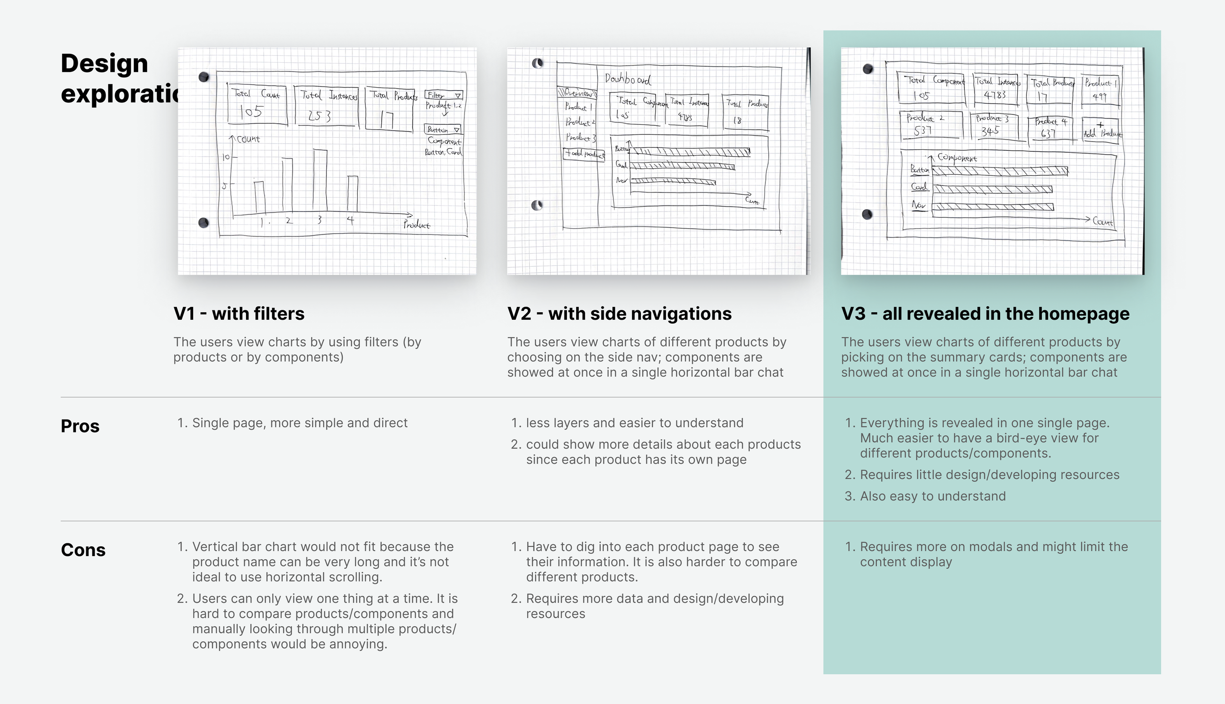
High information density with all metrics visible at once. Power users appreciated the overview, but non-technical stakeholders found it overwhelming.
Separated the three views into distinct tabs, reducing visual noise. The context switching required between views made comparison harder.
Single-page layout with summary cards at top and progressive detail below. The team selected V3 for its user-friendliness — everything accessible without navigation decisions.
After shipping, the design system team gained the visibility they'd been lacking. The dashboard enabled data-driven prioritization for the first time — and the results of the decisions it informed were measurable within the quarter.
With visibility into which teams were underusing the system, the design system team could reach out directly with targeted enablement. Adoption grew 17% in the quarter following the dashboard launch — a measurable outcome of having actionable data.
The component-level detachment view flagged four specific components with abnormally high detachment rates. Each was redesigned with input from the product teams detaching them. Overall detachment dropped 13% once those components were rebuilt to fit actual use cases.
Walking into a ticket with no requirements and a one-week deadline initially felt like a gap. It turned out to be a design problem in its own right — the first deliverable was clarifying what the dashboard needed to answer. Translating ambiguous asks into concrete use cases was the most valuable design work I did on this project.
In most product design work, the data exists and the challenge is presenting it. Here, finding alternative data sources was design work — shaping what the dashboard could even show. Design constraints come in all forms, and engineering conversations are often where the real design decisions happen.
I interviewed management but didn't reach the product teams who were actually consuming the design system. Their perspective on what data would change their behavior would likely have surfaced additional use cases — or reshaped existing ones. Time pressure compressed the research, but the tradeoff was real.
The best tool I could build wasn't a beautiful interface — it was the one that finally let the team make a decision with evidence instead of instinct.
— Shaw Chen, reflecting on the DS Analytics Dashboard sprint