Protected Case Study
This case study is password protected.
Incorrect password — try again.
← Back to all workSurfacing consumer signals across YouTube, web, and internal data — built to make Gemini's multimodal reasoning legible to enterprise decision-makers
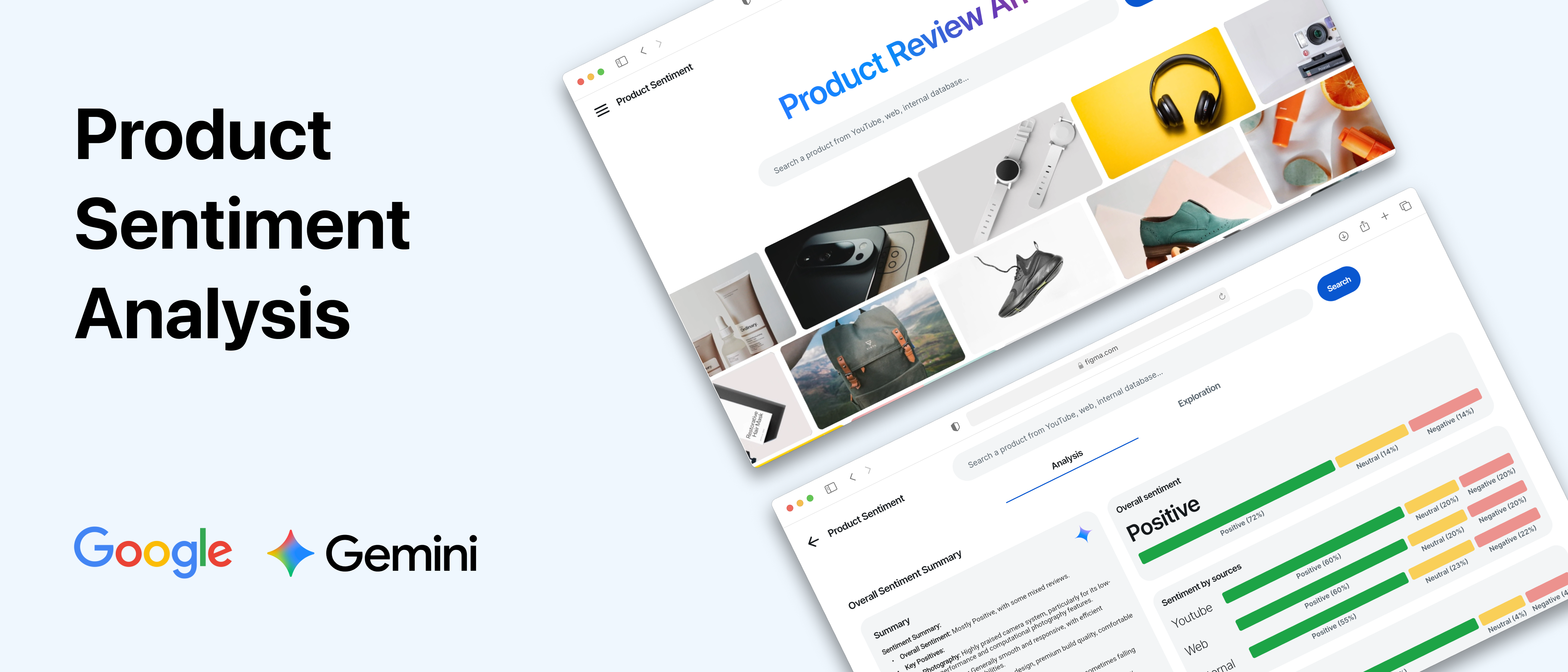
Project Sentio is a product sentiment analysis tool built on Gemini. Given a product, it ingests YouTube video reviews, web mentions, and internal documents in a single query — and returns a synthesized sentiment score, top positive and negative signals, and the source evidence behind each finding. The experience makes visible what Gemini is doing: processing genuinely different data modalities and reasoning across them to produce a unified business-ready output.
This was built as a working conference demo for an exclusive Google event attended by 200+ C-suite executives from global companies. The context mattered: these weren't developers. They were decision-makers evaluating whether to commit their organizations to Gemini. The design problem wasn't usability — it was making multimodal AI comprehensible and commercially credible to people who had the authority to say yes.
I led the project end-to-end — information architecture, high-fidelity Figma prototypes, and front-end implementation in FlutterFlow — collaborating with a four-person Google Cloud Gen AI engineering team. We shipped in two weeks.
“How might we design an experience that makes Gemini's multimodal advantage immediately legible — and commercially compelling — to enterprise decision-makers who have the power to adopt it?”
The homepage surfaces a moving carousel of real product images before any analysis runs. This immediately anchors the experience: Sentio is not analyzing abstract data — it is analyzing what real people are saying about specific products. Grounding the use case visually helped executives understand the problem being solved before they encountered the AI output.
Results are organized into dedicated tabs for YouTube, Web, and Internal sources — making Gemini's multimodal processing explicit rather than implied. Executives aren't told the model uses multiple sources; they can see each source's contribution separately. This turns what could have been a black-box output into a legible three-part story: what YouTube reviewers are saying, what the web is saying, and what internal data shows.
A distilled dashboard presents the overall sentiment score, top positive features (green), and top negative features (red) as scannable pills and tags. The design prioritizes two things: immediate readability without data expertise, and traceability — every signal can be traced back to the specific sources it came from, giving executives confidence that the analysis is grounded in real evidence rather than opaque inference.
A modal interface lets presenters dive into individual sources — surfacing specific summaries, sentiment tags, and verbatim quotes. Executives can see exactly where the AI's conclusions come from, building trust in the analysis.
The final step closes the loop: Sentio uses the sentiment findings as structured input and generates polished campaign images in real time. The intent was to show that product sentiment analysis doesn't end with a report — it can feed directly into business decisions. Curated prompts provided a low-friction starting point; the ability to input custom queries let executives test it against their own products and mental models.
The initial design consolidated all sentiment results into a single feed. It obscured the most important thing we needed to show: that Gemini was reasoning across genuinely distinct data modalities, not just one big dataset.
A tabbed approach organized results by source (YouTube, Web, Internal), allowing the presenter to deliberately walk the audience through each data type as a structured, three-act narrative.
Transformed a cluttered feed into a structured three-act story. Each tab became a distinct beat, making Gemini's multimodal reasoning observable and legible rather than invisible.
Initial high-fidelity visualizations — complex charts and graphs — exceeded what the engineering team could build in two weeks. The model also only output a limited set of data points: a sentiment score, top positive features, and top negative features.
Focused entirely on actual model outputs. Designed a large, prominent sentiment score alongside two columns of color-coded pills (green for positive, red for negative) with icons — no chart expertise needed to read.
A dashboard that was both feasible to build and more direct for the audience. The engineering constraint actually improved the design — a lesson in letting constraints clarify intent.
Instead of a traditional design-then-handoff cycle, I built the front-end directly in FlutterFlow — a low-code platform that enabled immediate, tight feedback loops between design intent and engineering implementation.
When the back-end team surfaced data limitations mid-sprint, I could adjust the UI in real time — compressing days of back-and-forth into hours. A parallel Figma prototype also served as a reliable offline backup for the conference presentation, ensuring we were never at the mercy of conference Wi-Fi.