Tipaipai Mobile UX Research-Led 2021 Shipped ✅

Turning 77% First-Day
Churn Into Loyalty

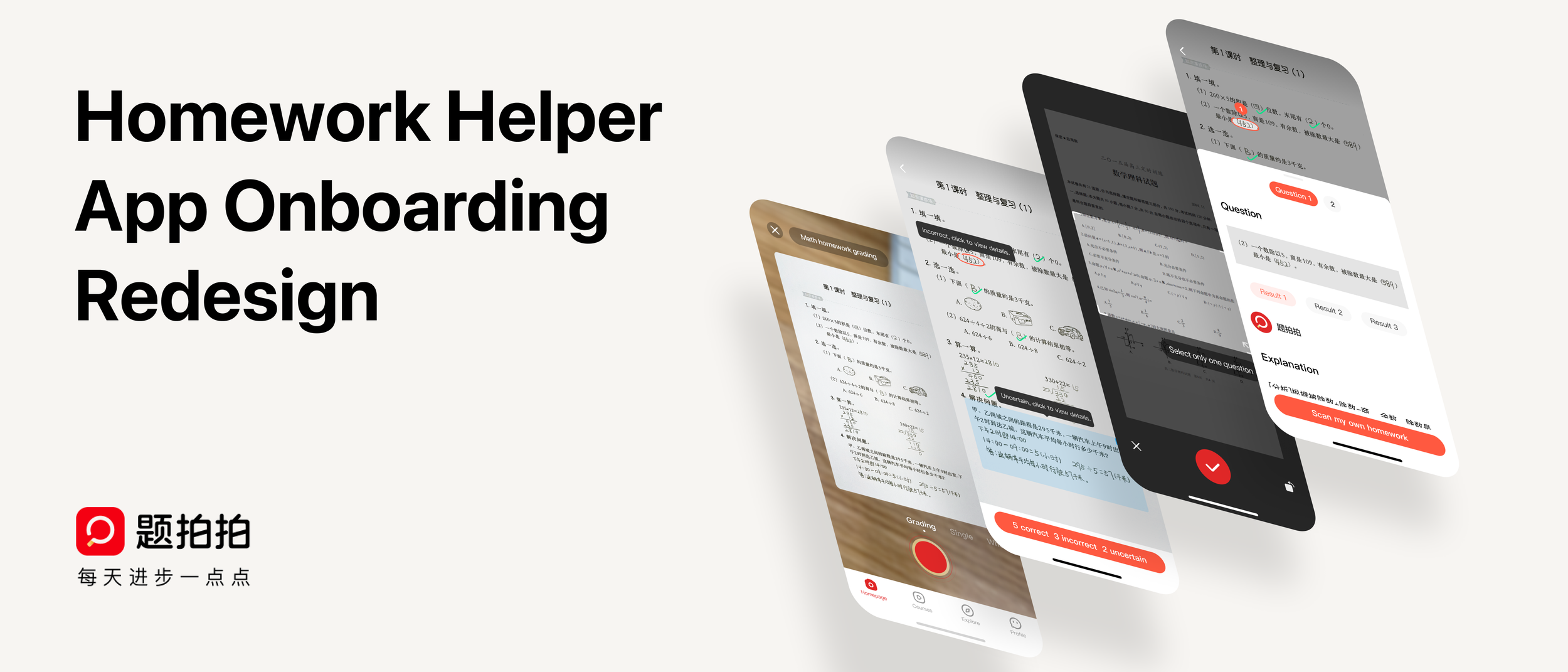
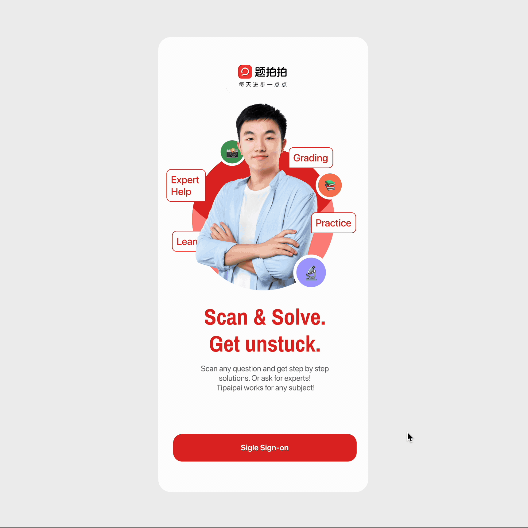
Tipaipai Homework Helper — Onboarding Redesign

Duration
Mar – Jul 2021
My Role
UX Design & Research Lead
Team
Tipaipai UXD Team
Key Result
23% → 55% next-day retention
Status
✅ Shipped
Tipaipai Onboarding Redesign
Overview

The App That Loses
Everyone on Day One

Tipaipai is a quiz-scanning app that helps K-12 students photograph their homework and receive step-by-step solutions and explanations. With 20 million+ users, the product had real traction — but a critical problem lurked at the entry point.

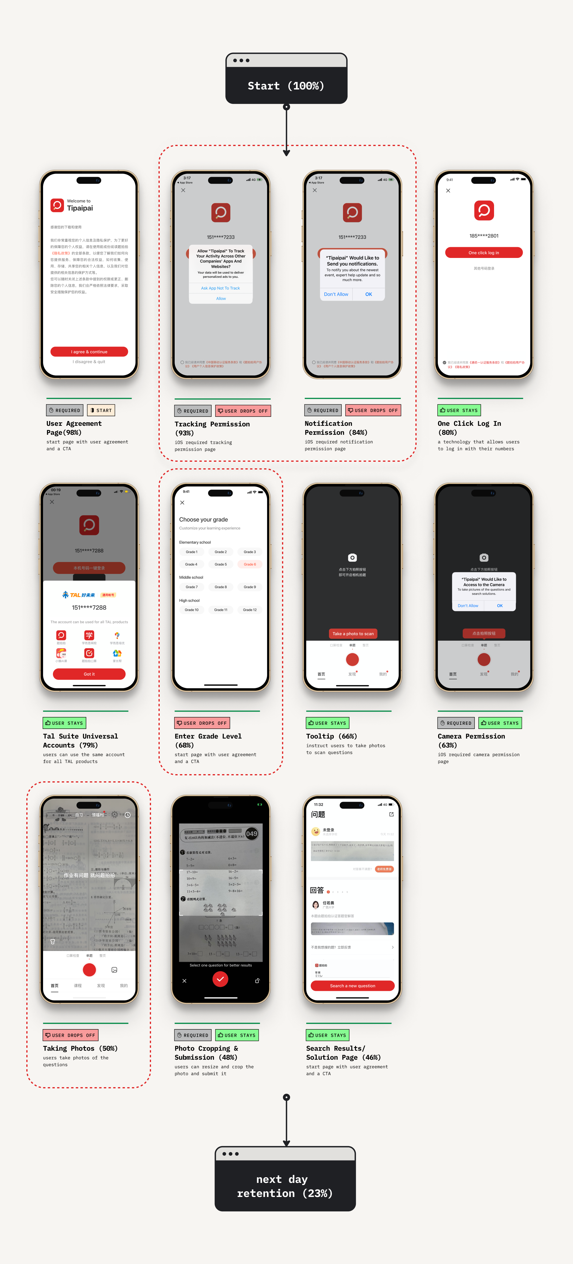
77% of new users didn't return after day one. Despite a compelling core product, the onboarding experience was leaking almost everyone who walked through the door.

I led a research-driven redesign of the full onboarding flow — from funnel analysis and user interviews through design iterations and usability testing — ultimately shipping a new experience that more than doubled retention.

+32pp next-day retention lift
Onboarding completion rate lifted from 46% → 69%. Next-day retention jumped from 23% → 55% within two weeks of launch.
Duration
March – July 2021
Role
UX Design & Research Lead
Team
Tipaipai UXD Team (PM, engineers, QA, marketing)
Methods
Funnel analysis · In-app survey · User interviews · Usability testing
Status
✅ Shipped
Quantitative Research

What Does the Data Say?

Finding 01 — Funnel Drop-off
25%lost
Two friction points accounted for nearly all early churn: 14% of users dropped off at the tracking & notification permissions screen, and another 11% left at the "enter grade level" screen. The data made the culprit clear: we were asking for too much, too soon — before users had seen any value from the product.
Onboarding funnel showing drop-off points
Random photos submitted by first-time users
Finding 02 — User Behavior
29%random pics
Nearly a third of first-time users submitted completely unrelated photos — floors, desks, ceilings. Not because the app confused them, but because they weren't doing homework when they downloaded it. They'd found the app through browsing or ads and were simply exploring. The product had no answer for that journey.
Qualitative Research

What Do Users Say and Do?

In-app survey banner
In-App Survey · n = large sample
"58% of users weren't doing homework when they first downloaded the app"

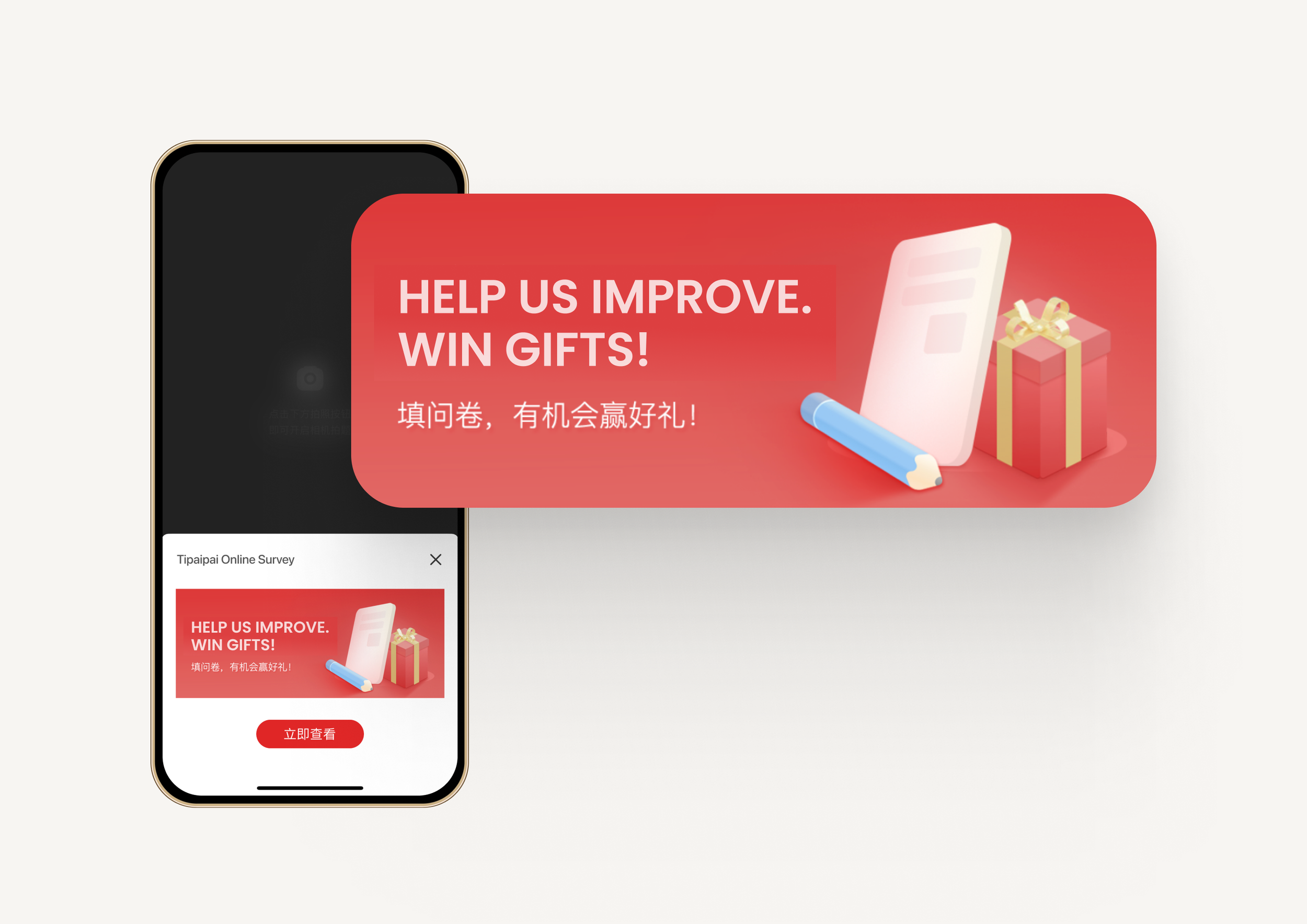
I designed and deployed a pop-up survey banner to understand why users were downloading but not converting. The majority had come through ads or app store browsing — not because they had homework in front of them. The product needed to meet explorers where they are, not just where we assumed they'd be.

Quotes from churned user interviews
5 Churned User Interviews + 6 Usability Sessions
"Users need guidance on the two features that define the product"

Interviews with users who hadn't returned within a month surfaced frustration with the core scanning experience. Usability testing with six students revealed specific pain points:

  • 2 of 6 students had difficulty cropping photos in single-question search mode
  • 3 of 6 students used only the default mode — never discovering mode switching existed
  • 2 of 6 students were entirely unaware that different search modes existed at all
Problem → Solution

Four Problems. Four Solutions.

01
Users don't capture homework pictures upon initial app use because they're not in a homework context when they download.
Solution
Offer a live demo so explorers can experience the product's value without homework in hand.
02
Significant user loss stems from premature permission and information requests — before the product has demonstrated any value.
Solution
Ask for permissions and personal information contextually, at the moment they become relevant and useful.
03
Search modes suffer from poor discoverability — most users never know they exist, limiting the product's perceived capability.
Solution
Implement lightweight interactive walkthroughs that introduce mode switching at the right moment.
04
Many users are unaware of — or unsure how to use — the photo cropping feature, causing frustration in the core task.
Solution
Introduce a one-time dismissible cropping guide that teaches the gesture in context, the first time users encounter it.
Design

Three Features,
One Cohesive First Experience

Demo homework grading experience
Feature 01 — Homework Demo

Let Explorers Experience
the Product First

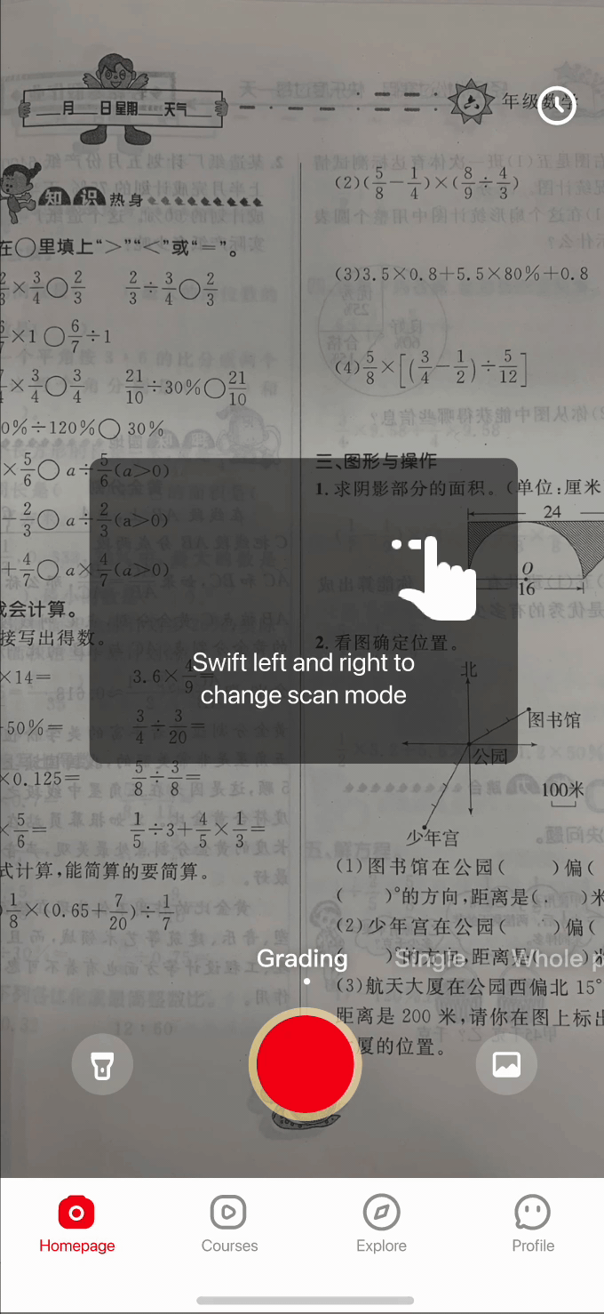
Instead of hitting explorers with a blank "take a photo" screen, the redesign opens with a guided demo of the homework grading feature. Users can try out the scanning experience with a pre-loaded example — understanding exactly how the product works and why it's valuable, before they ever upload their own work.

Refined through playtesting with real students (including my nephews)

Iteration 1 — Hot search and demo list
Iteration 01
"Don't make another social media app"

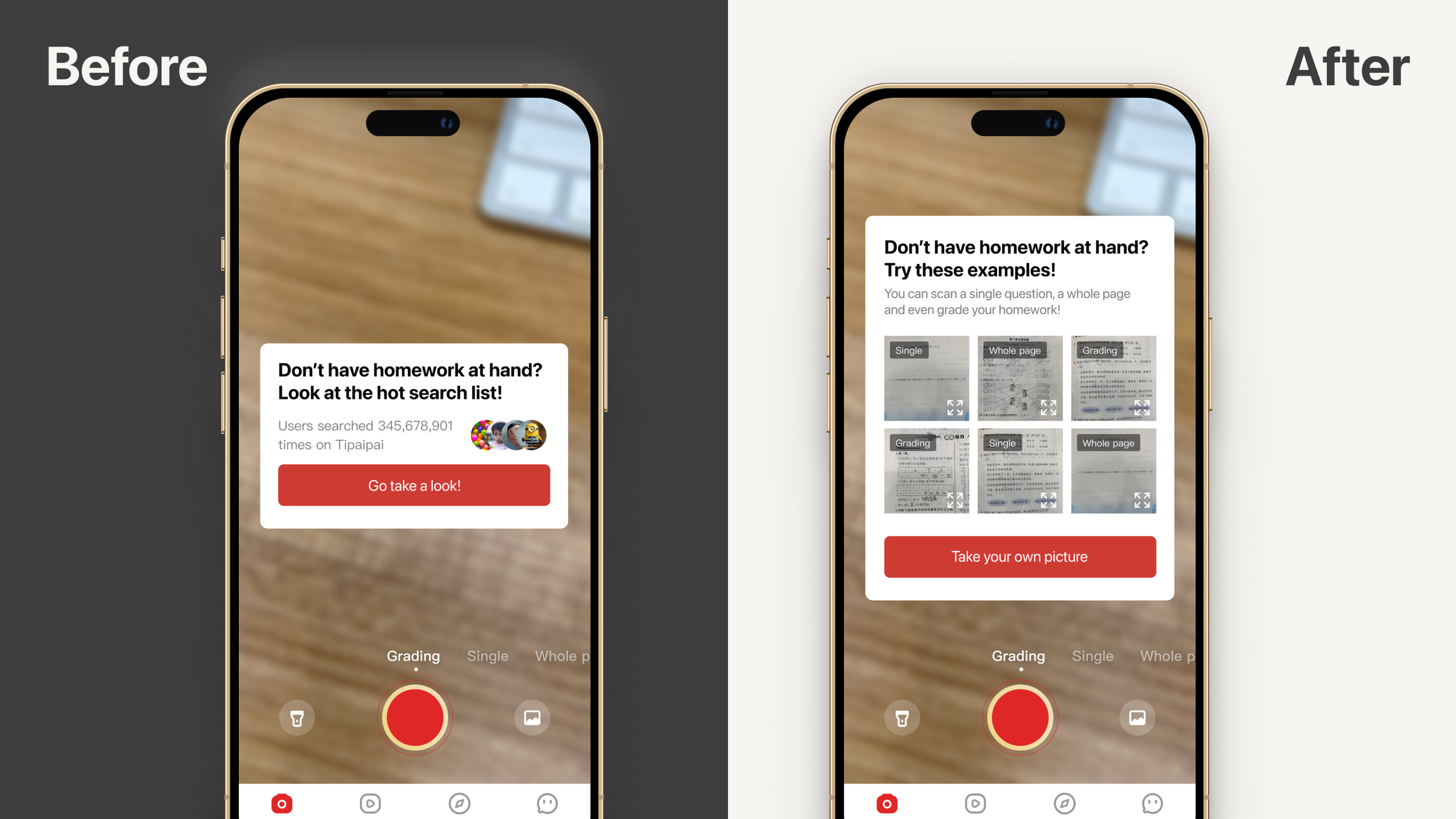
Initial design featured a hot search list and demo list. Testing revealed confusion about the hot search list's purpose — it felt like a trending feed, not a homework tool. Pivoted to sample homework cards.

Iteration 2 — Reduced demo options
Iteration 02
"Avoid decision fatigue"

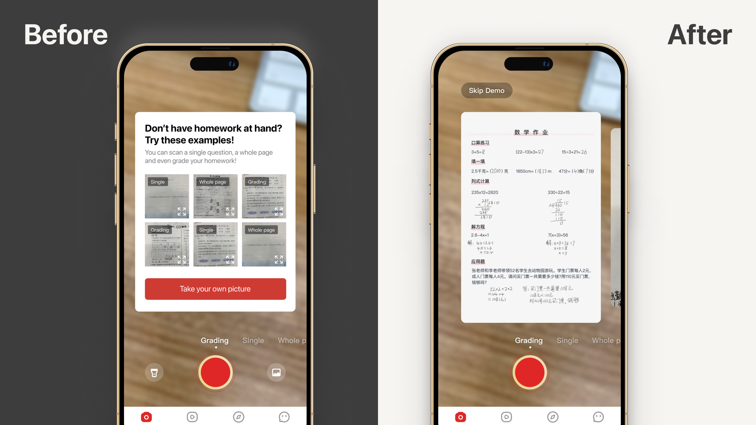
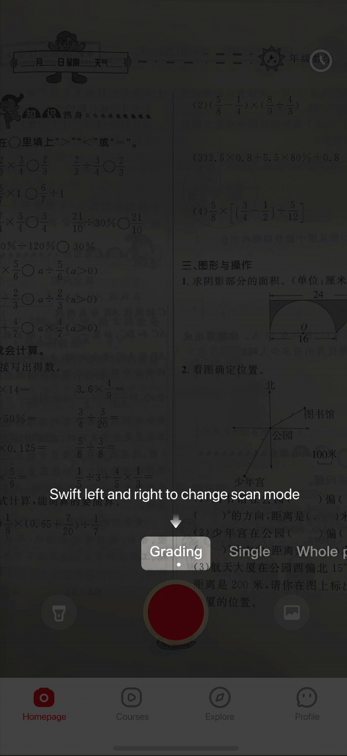
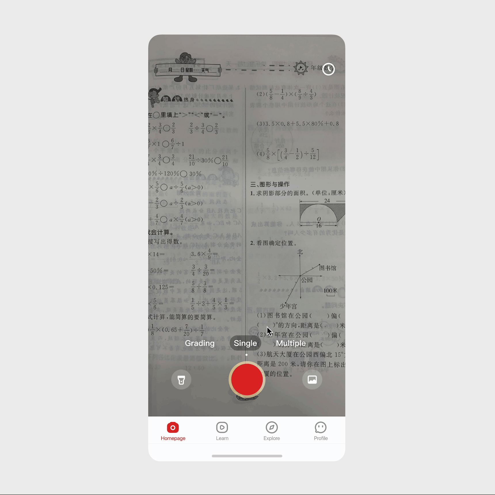
The demo list offered multiple samples and modes, but participants froze and paused for extended periods. Reduced to a single swipeable sample per mode, eliminating the extra choice layer.

Iteration 3 — Final with mode titles
Iteration 03
"Fine-tuning the details"

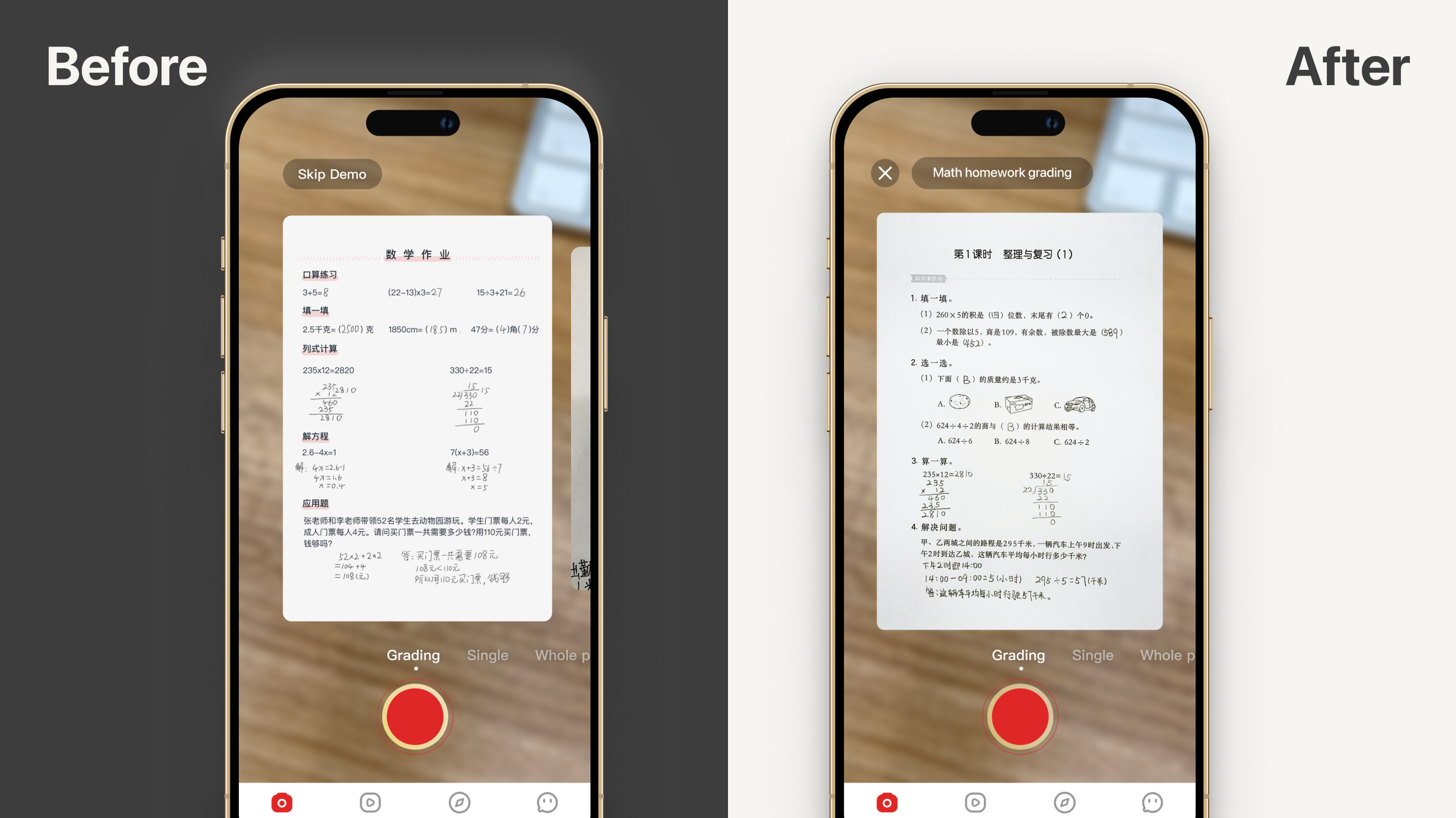
The swipe gesture to change modes was invisible to most users. Streamlined to one sample per mode with mode-specific titles — making each mode's value legible at a glance.

Interactive walkthroughs
Feature 02 — Interactive Walkthroughs

Teach by Doing,
Not by Reading

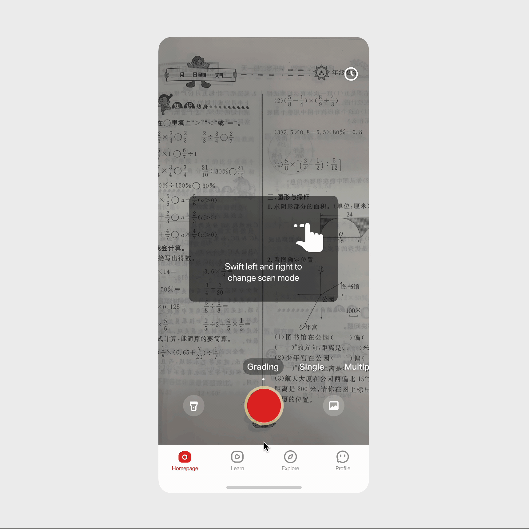
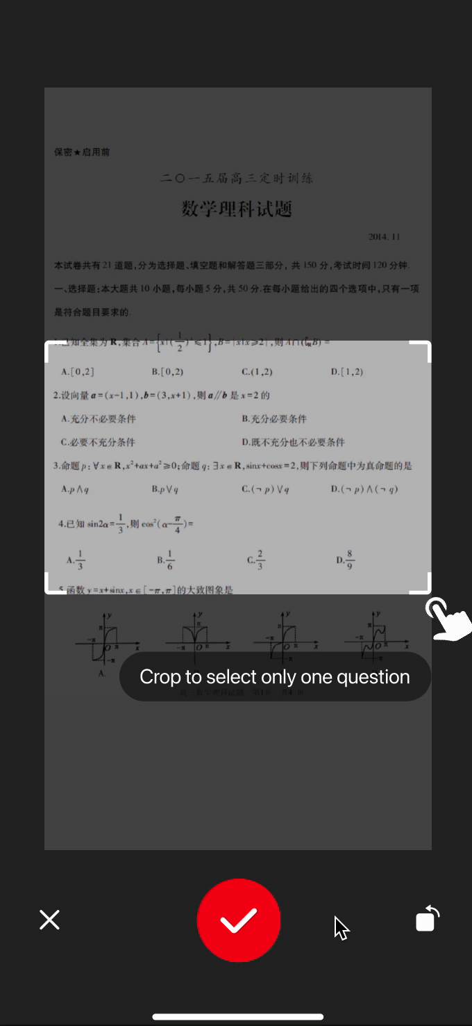
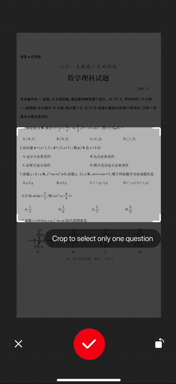
Each walkthrough is a one-time dismissible modal that appears in the exact context where the feature is first encountered — not as an onboarding lecture. The cropping guide appears when users first crop a photo; the mode-switching guide appears on the search screen. Learning happens in the flow, not before it.

Two visual directions were explored for the walkthrough animations:

Cartoony crop gesture Cartoony switch mode gesture
Exploration A — Cartoony Gestures
Pro Direct and clear; likely appealing to the younger K-12 audience who are familiar with game-style tutorials.
Con Doesn't align with Tipaipai's minimalist design principles and clean visual brand.
Subtle crop gesture Subtle switch mode gesture
Exploration B — Subtle Visual Effects
Pro Minimalist, on-brand, and consistent with the product's clean design language.
Con May be less intuitive for younger students who expect more explicit visual cues.
Ask for information at the right time
Feature 03 — Contextual Information Collection

Ask When It
Actually Makes Sense

Instead of front-loading the flow with grade level and notification permission requests, we moved them to the moment of natural relevance. Grade level is now requested when users first arrive at the Explore page — where personalized content is immediately visible — making the request feel helpful rather than intrusive. The 11% drop-off at that screen was eliminated.

Impact

Results Two Weeks
After Launch

Onboarding Completion Rate
46% before
69%
+23 percentage points — more users reaching the core product
Next-Day Retention Rate
23% before
55%
+32 percentage points — even with a slightly longer onboarding flow
Before and after metrics timeline
Reflection

What I Learned

01

User interest diminishes rapidly. You have a narrow window to communicate your product's value. The first screen isn't a formality — it's the product's only chance to give users a reason to come back. Every friction point before that moment is a leak.

02

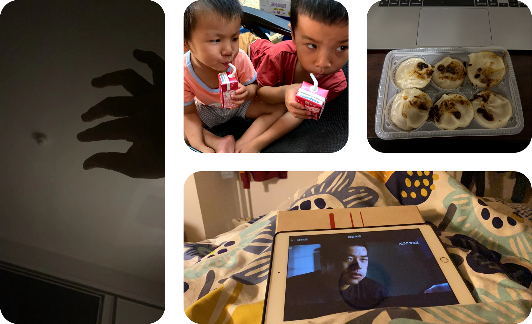
Don't wait for perfect conditions to test. My nephews — informal, un-recruited — gave me the most actionable iteration feedback I received. Early-stage testing with imperfect participants beats waiting for the "right" setup every time.

03

Embrace iteration and stay unattached. Each of the three demo iterations looked like the right answer in the moment. Staying curious enough to test and honest enough to abandon ideas that aren't working is where the real design leverage lives.

Next Case Study
Salt Tracker → ← Back to all work