
Baidu UI Design Challenge — Lifestyle-Sharing Community App
As part of my application for a UI Design Internship at Baidu — China's largest search engine — I was given a single design challenge: design a lifestyle-sharing community app for young users in 24 hours. No existing brand, no provided assets, no prior brief. Just a prompt, a deadline, and Adobe XD.
The challenge required both research and execution. Before touching a single frame, I needed to understand the landscape of lifestyle-sharing apps in China — the information architecture that worked, the patterns users already knew, and what would feel fresh without being confusing to the target demographic.
The submission advanced me through the application rounds and ultimately resulted in a job offer from Baidu's design team. The offer couldn't be accepted due to a legal complication with my student status — but the challenge itself became one of the most clarifying design experiences of my early career.
Research lifestyle-sharing product information architecture. Analyze main features and selling points, then design community app interfaces for young users — including a home/feed page with navigation and user-generated posts, and a post details page supporting pictures and video.


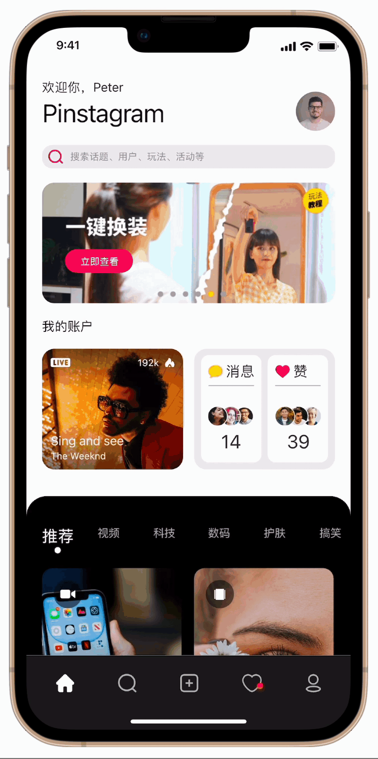
The homepage centers the experience on visual content — a card-based feed designed for browsing rather than searching. The layout is informed by how users of platforms like Xiaohongshu navigate: relying on imagery as the primary hook, with text serving as supporting context rather than leading information. Navigation stays persistent at the bottom, keeping the most common actions always within thumb reach.
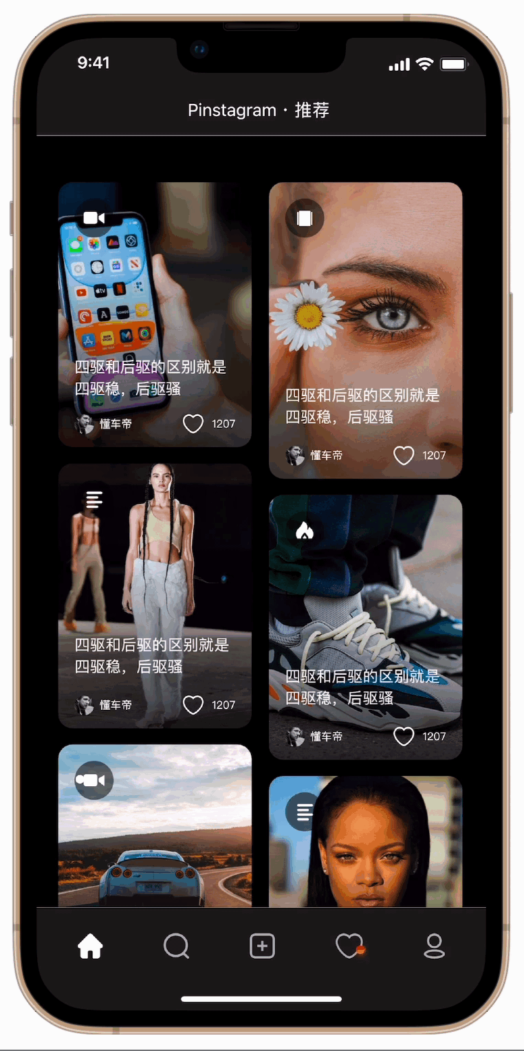
The browsing interaction demonstrates the feed's scroll behaviour and how content loads in context. Momentum scrolling and natural physics were prioritised to feel native to the platform — the experience needs to disappear so users can focus entirely on the content, not the interface.
Tapping a card expands into the full post view — supporting both photo galleries and video playback. The transition preserves context: users feel they're going deeper into something they chose, not abandoning the feed. Creator attribution and engagement actions (like, save, share) are positioned for easy access without competing with the content itself.
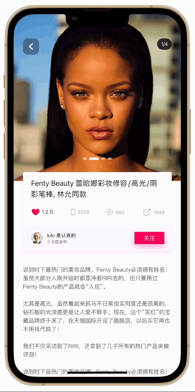
The comment section slides up as a bottom sheet — keeping the original post visible above and maintaining spatial context. For a lifestyle-sharing app, the conversation beneath a post is as valuable as the post itself. The design gives it room to breathe without burying the content that sparked it.
The submission advanced me through every round of Baidu's application process. A job offer arrived from their design team — a direct confirmation that what I built in 24 hours met a professional standard at one of China's largest technology companies.
A legal complication with my student status made it impossible to accept the offer. The experience couldn't convert into the role — but it did something more lasting: it gave me real evidence that I could perform under extreme time pressure, and the confidence that comes from earning a yes.
Research is the fastest shortcut. Spending the first three hours on competitive analysis felt like a risk against the clock. It wasn't — it meant every design decision after that had a reason. The investment in understanding before building prevented false starts that would have cost far more time.
Constraints clarify priorities. A 24-hour window eliminates the option of perfecting every detail. You learn quickly what actually matters — what makes a product feel considered versus what's just polish. Designing under real pressure surfaces a kind of decision-making that comfortable timelines never require.
Outcomes aren't always in your control — effort is. Not being able to accept the offer was disappointing. But what the challenge produced — the work, the confidence, the proof of capability — stayed with me regardless. The best reason to do difficult things well is the person you become by doing them.